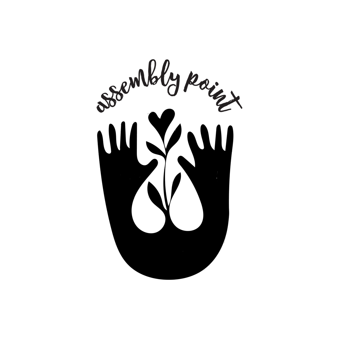
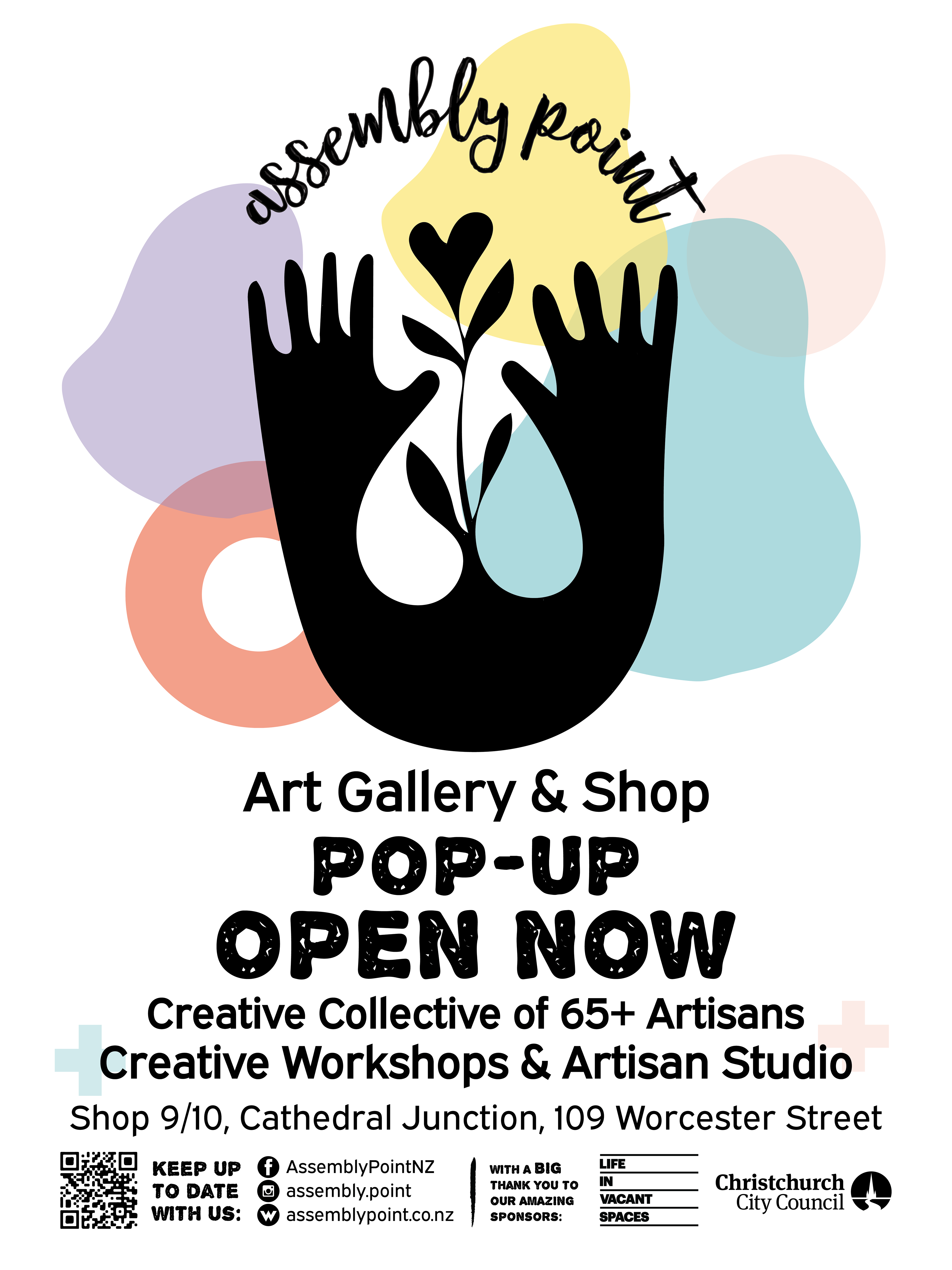
The Assembly Point logo was used for an artist space and long term pop-up shop. This logo was a mixture of throwing back and forth ideas between myself and my co-coordinator. We wanted an organic feeling logo
using hands and hearts and plants to represent the handmade items, and supportive environment that the space provided. She ended up doing a sketch with this imagery, which I digitised into this stamp like logo and
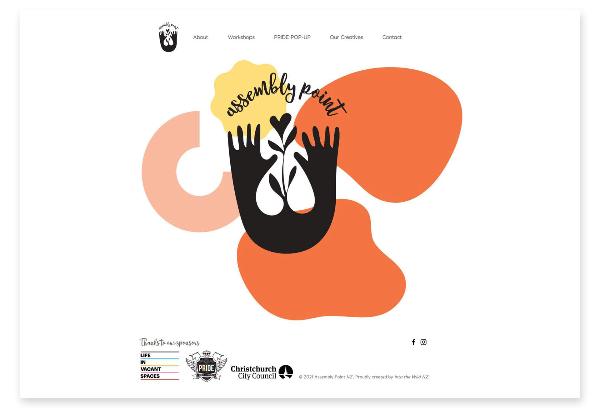
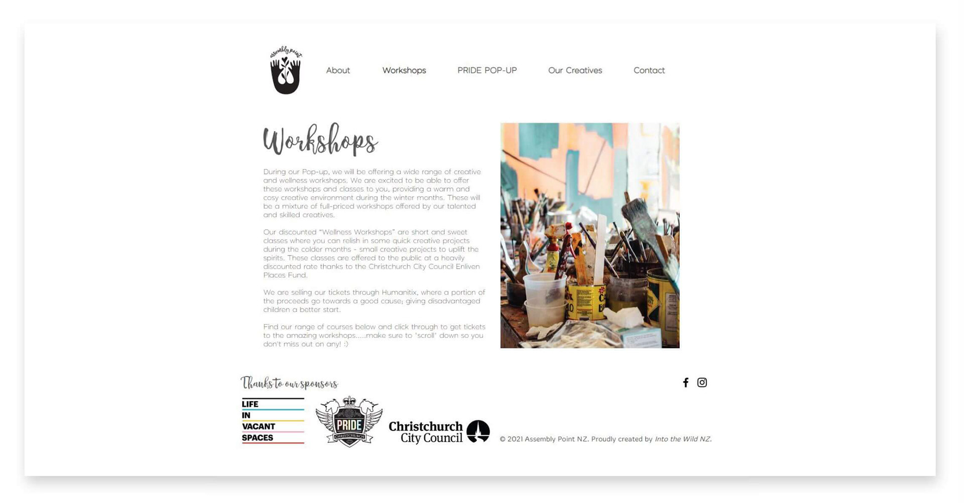
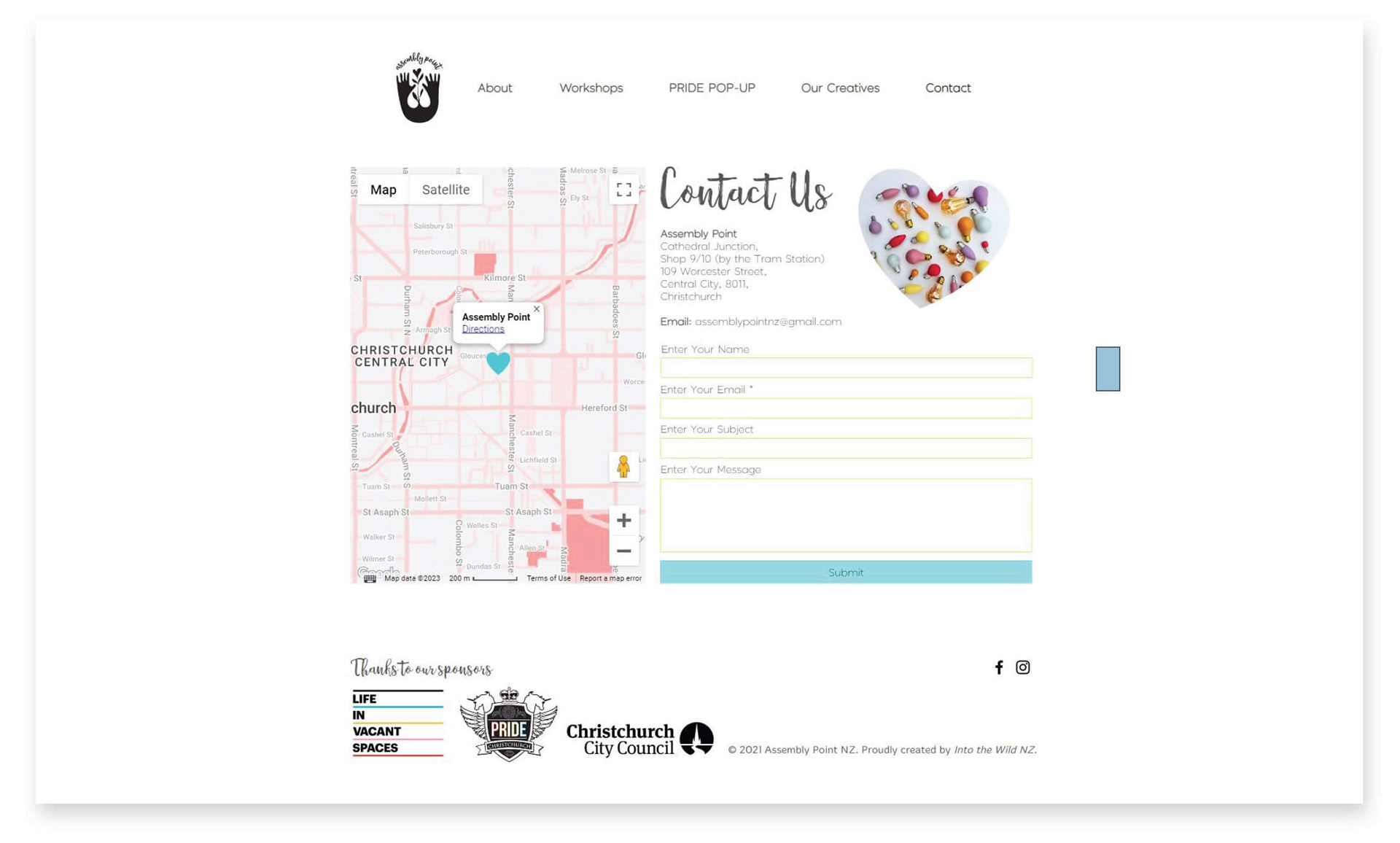
added the name branding to. From that, I designed the website, shown in the other images that we used to share information with our customers and allow for workshop bookings (not shown). It was also used for instore advertising and branding, advertising posters, business cards and as a stamp for our paper packaging.
using hands and hearts and plants to represent the handmade items, and supportive environment that the space provided. She ended up doing a sketch with this imagery, which I digitised into this stamp like logo and
added the name branding to. From that, I designed the website, shown in the other images that we used to share information with our customers and allow for workshop bookings (not shown). It was also used for instore advertising and branding, advertising posters, business cards and as a stamp for our paper packaging.
Click on the images below to flick through and enlarge.
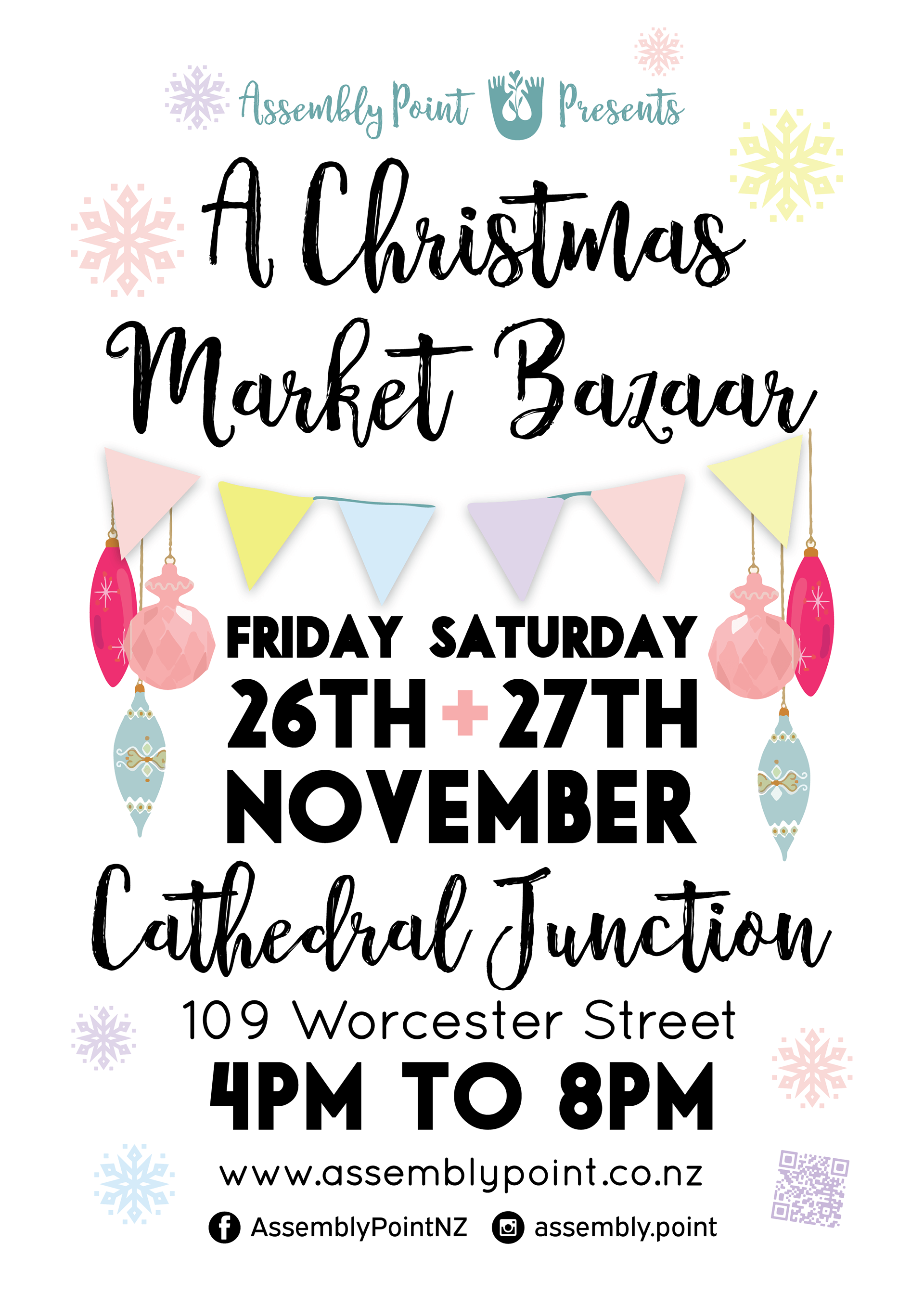
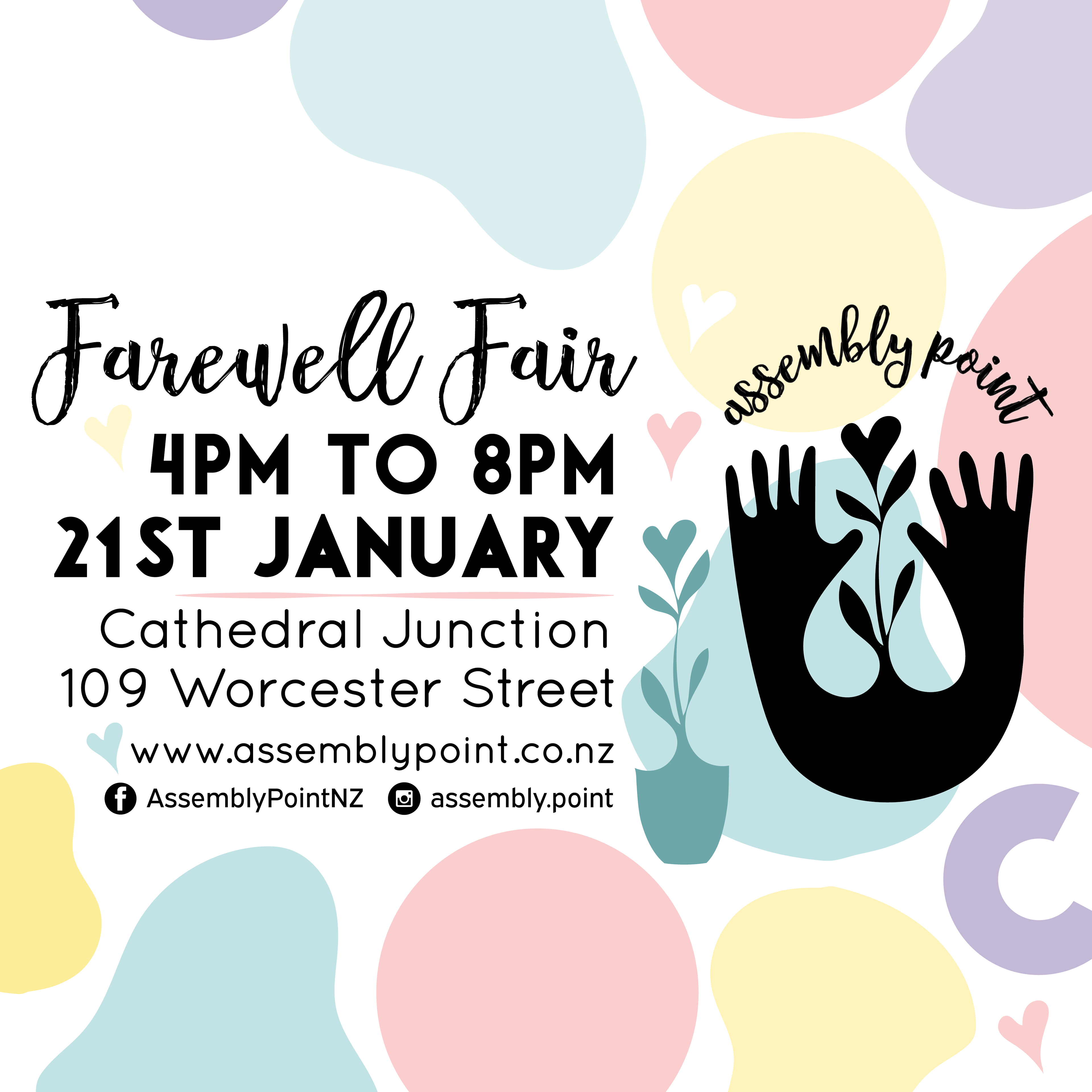
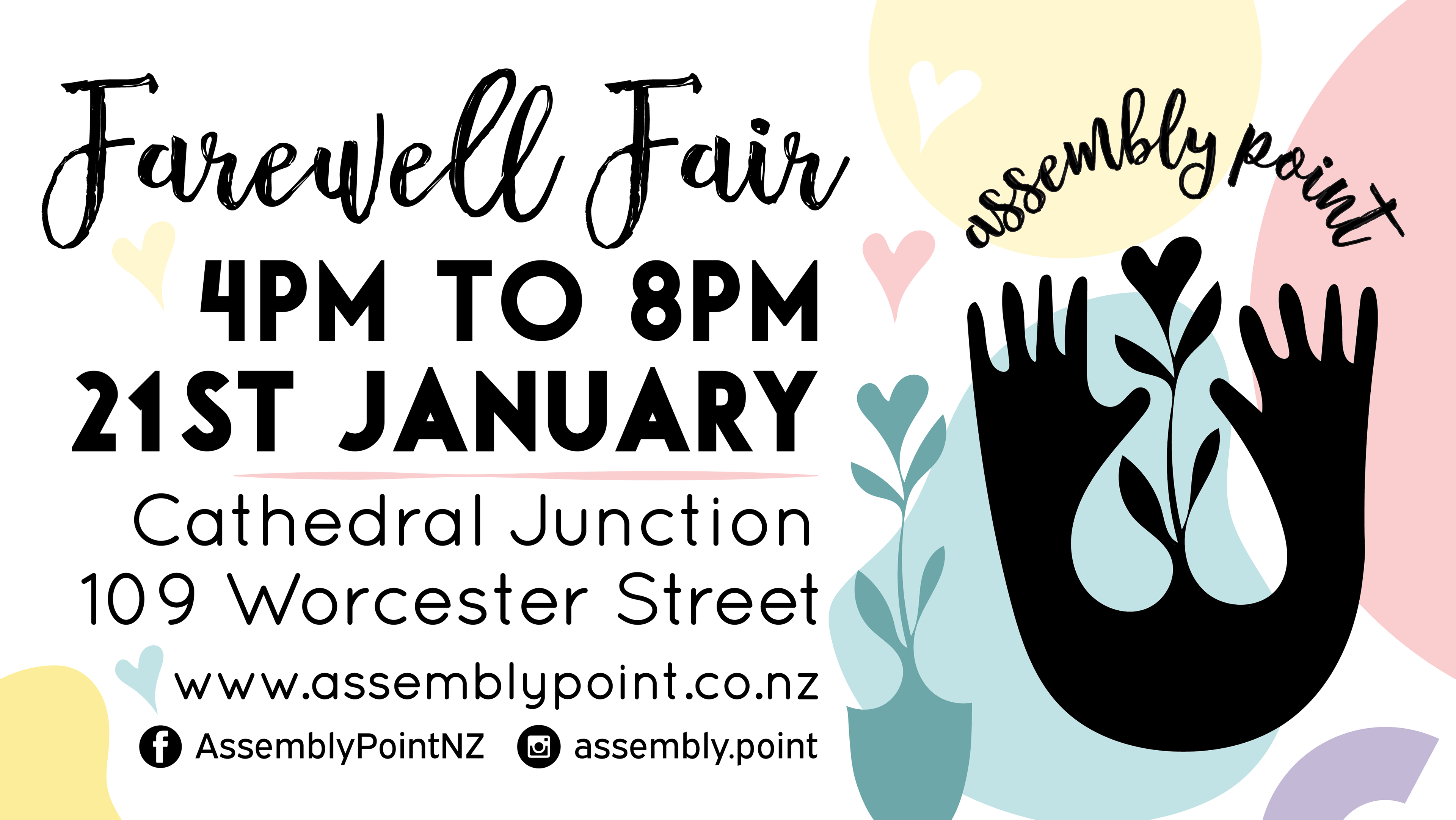
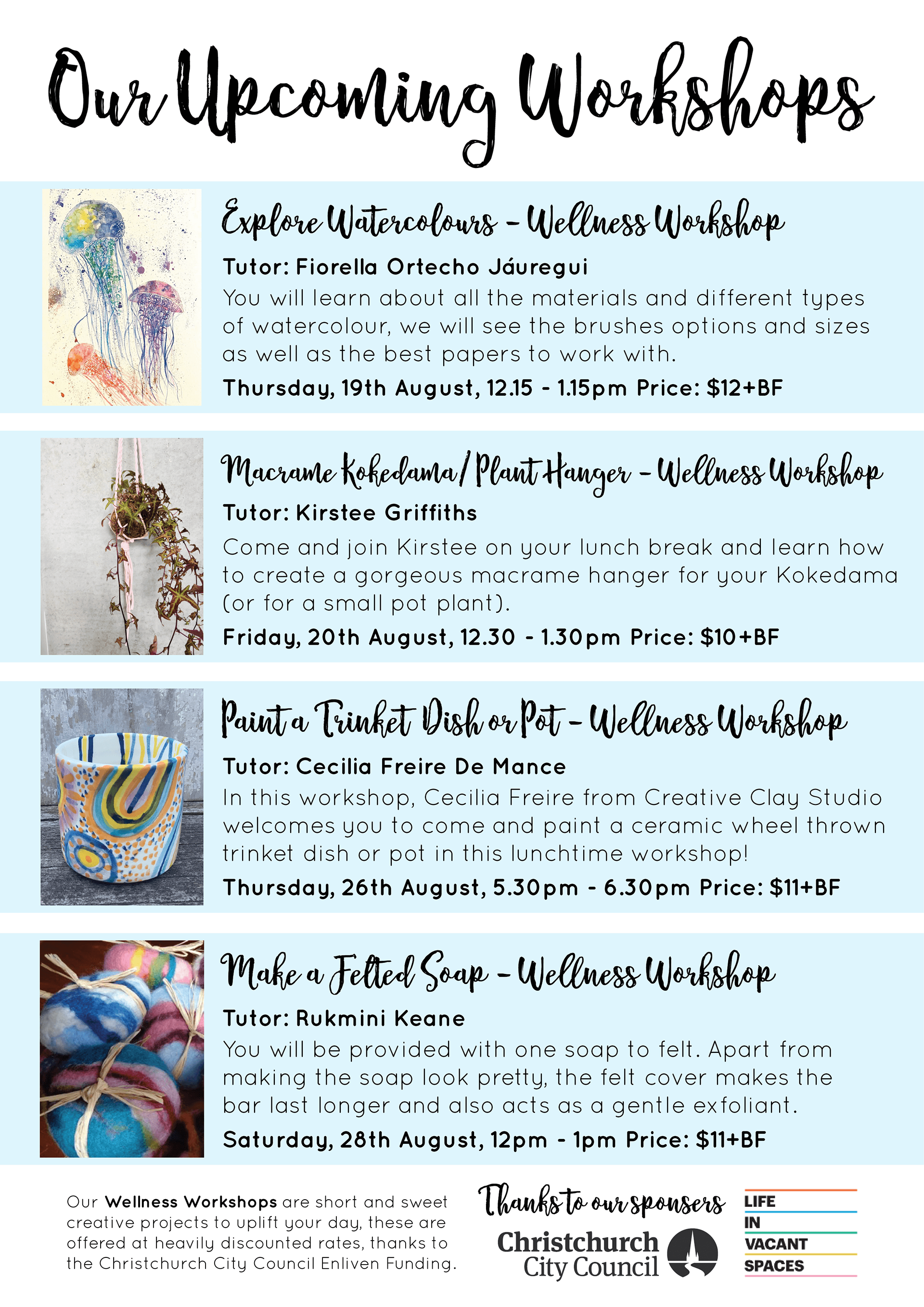
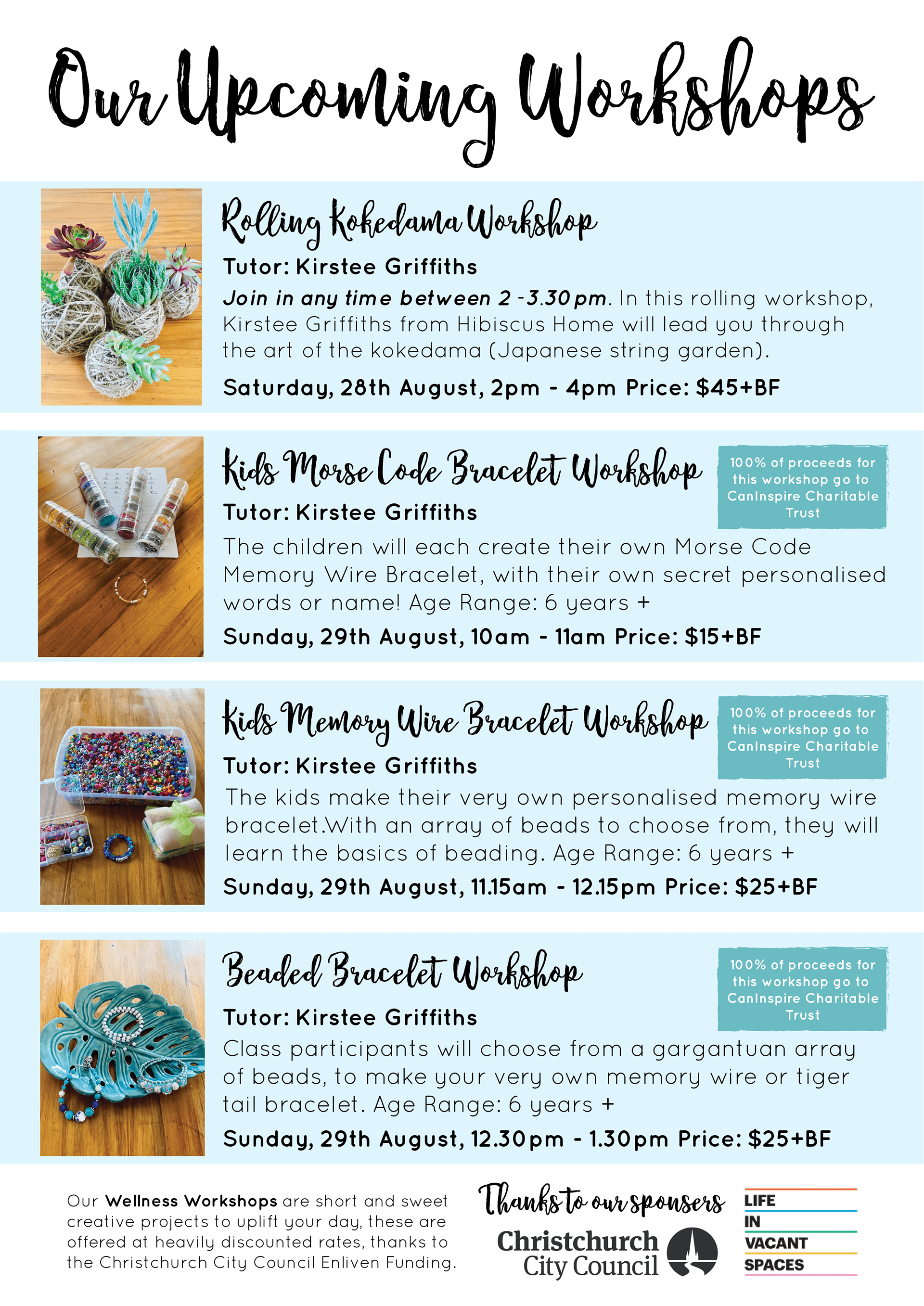
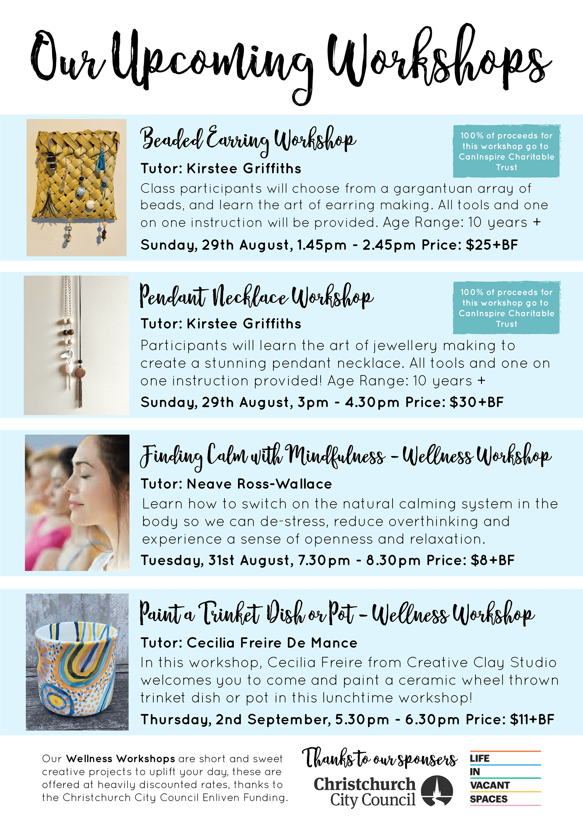
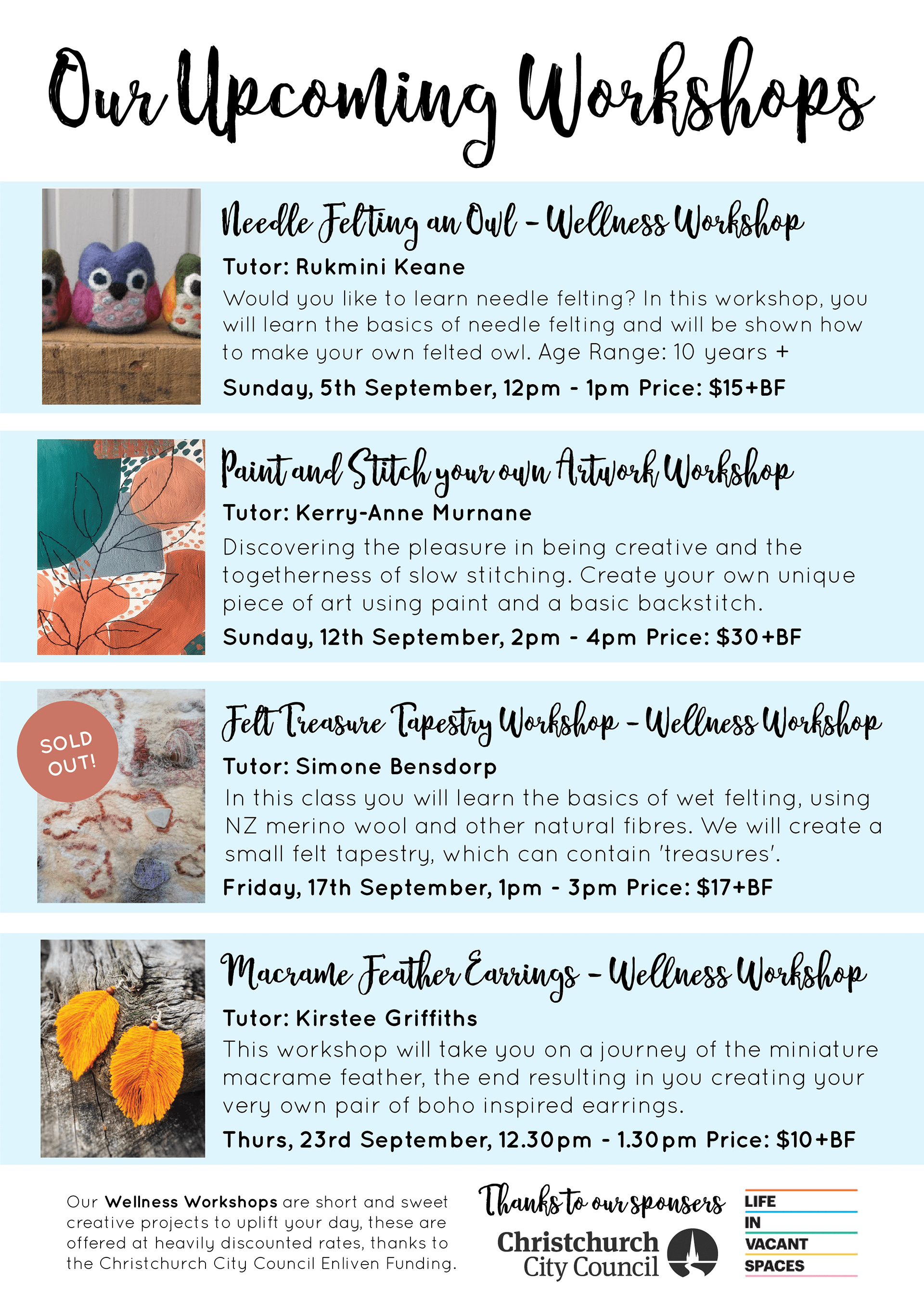
Below are some of the posters and advertising that I created along the way for the space and events, including some of our workshop advertising. These were used as printed posters, in our shop and window and around the neighbouring area, as well as on social media.
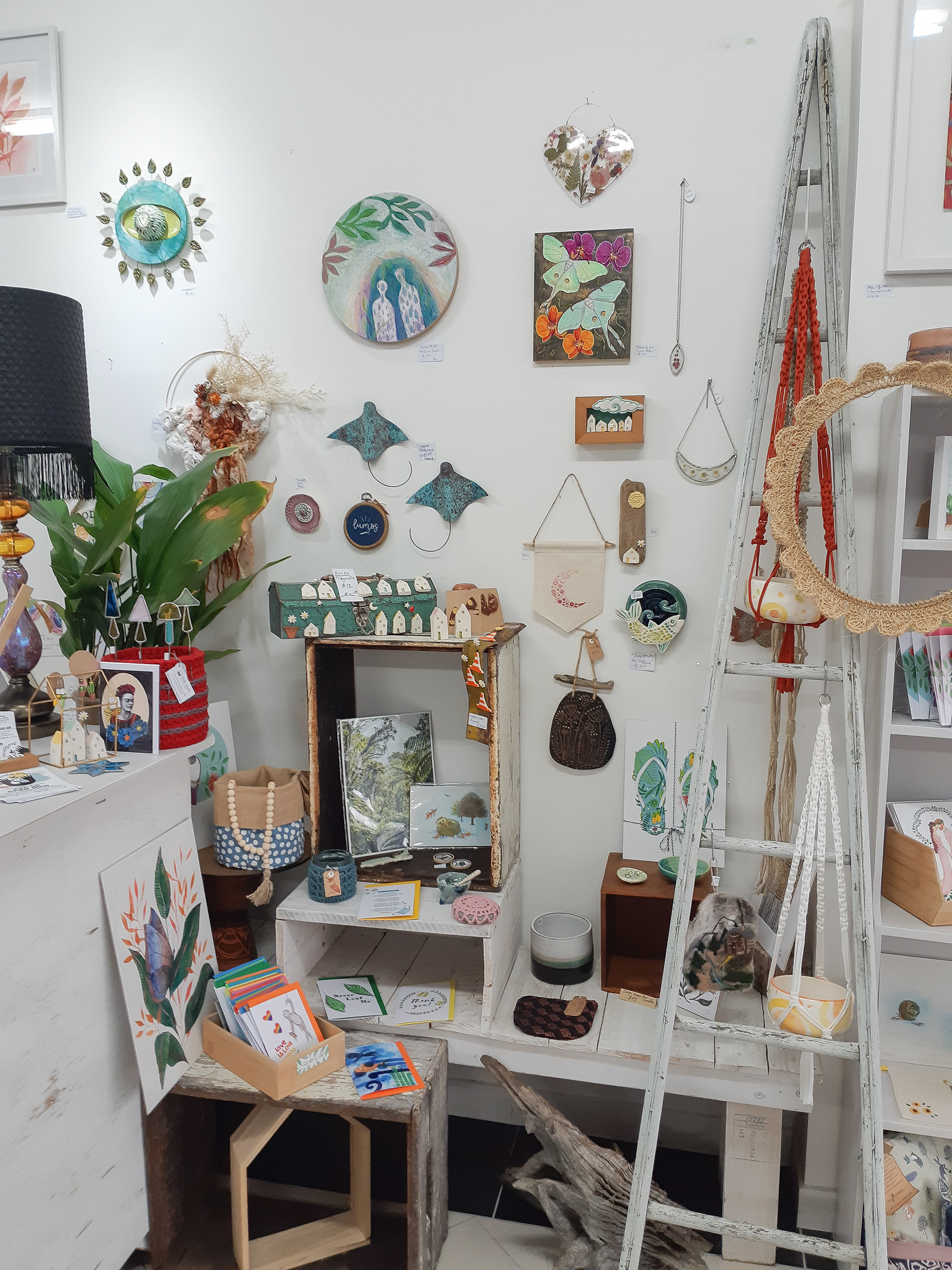
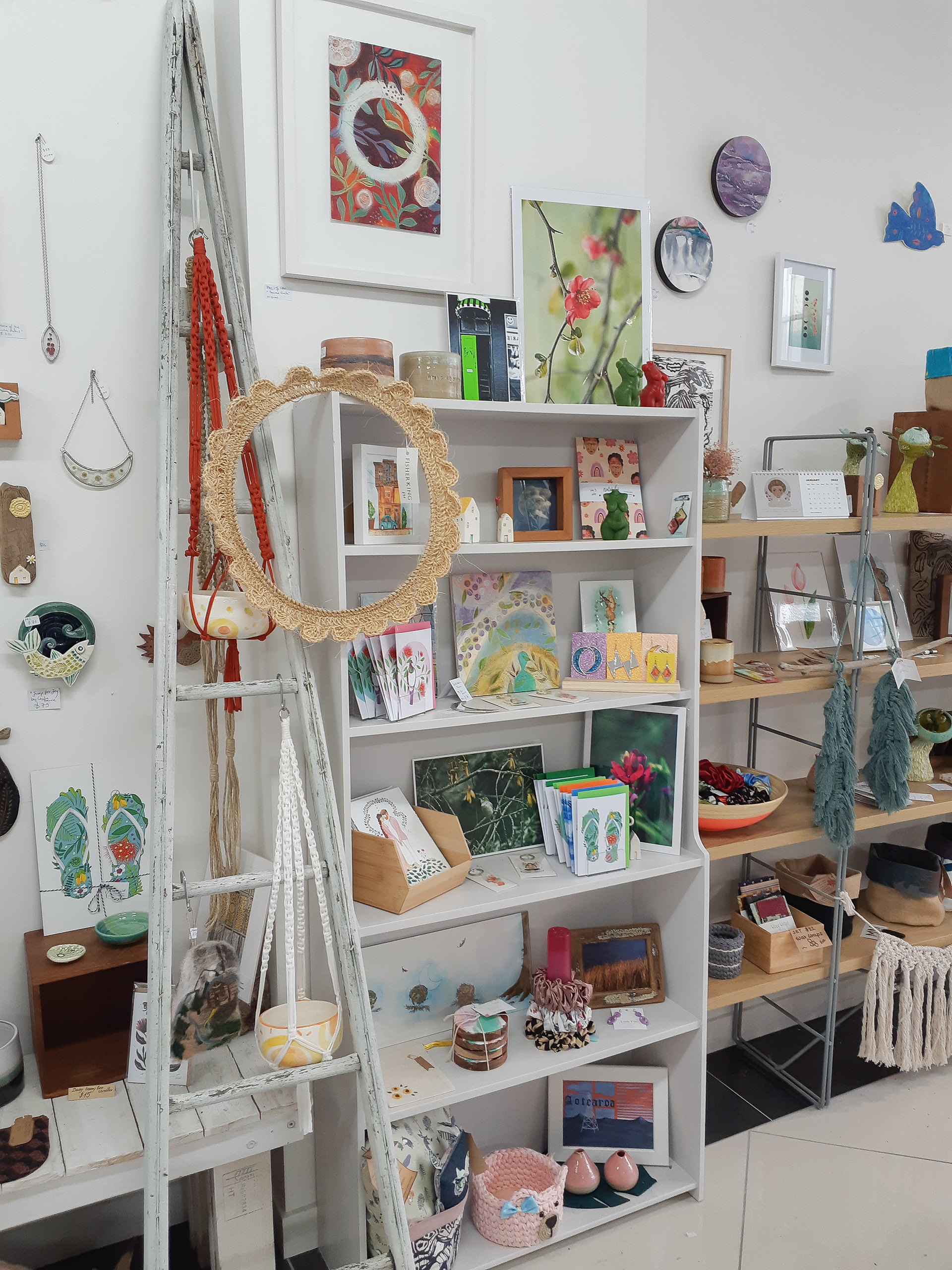
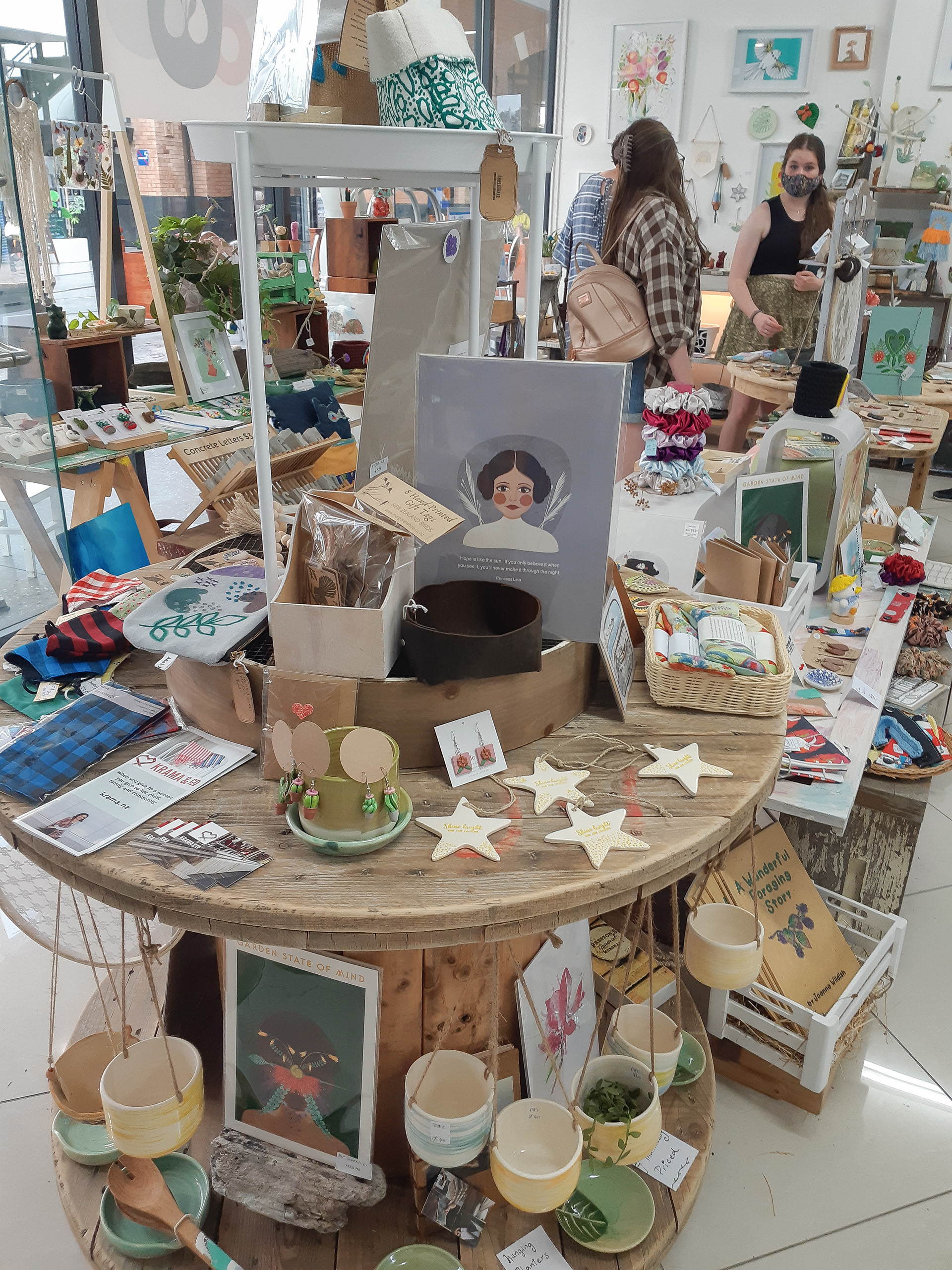
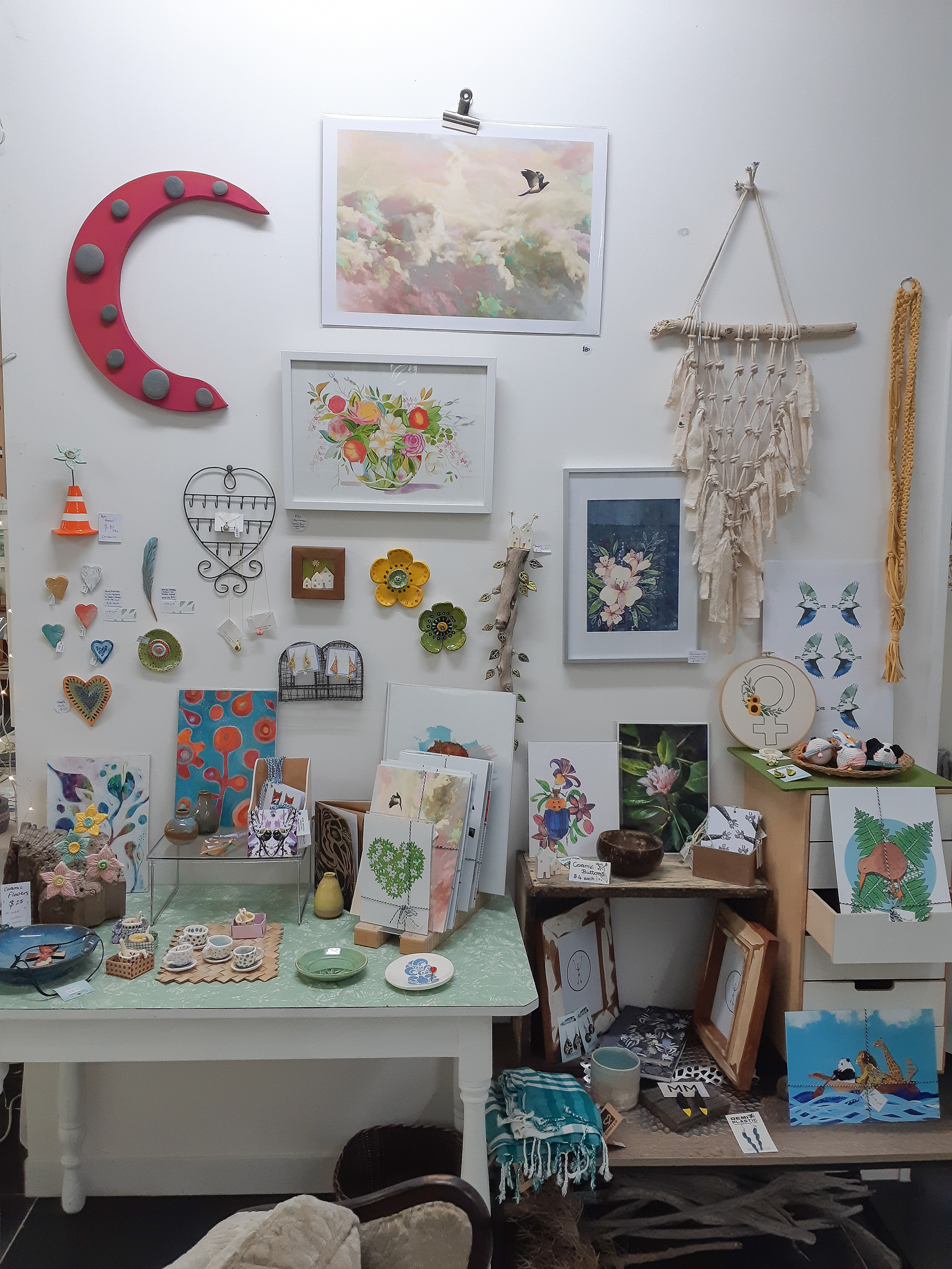
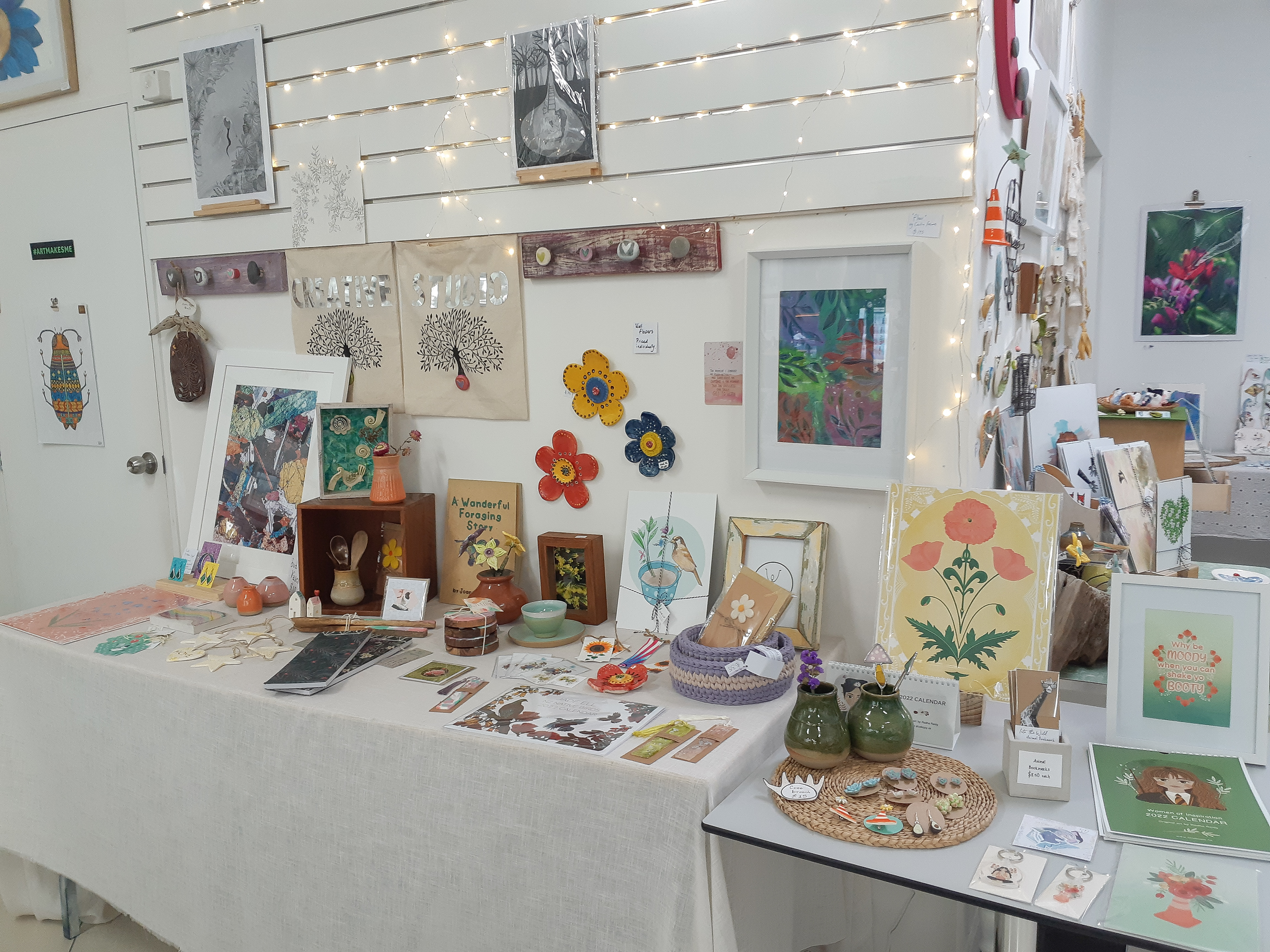
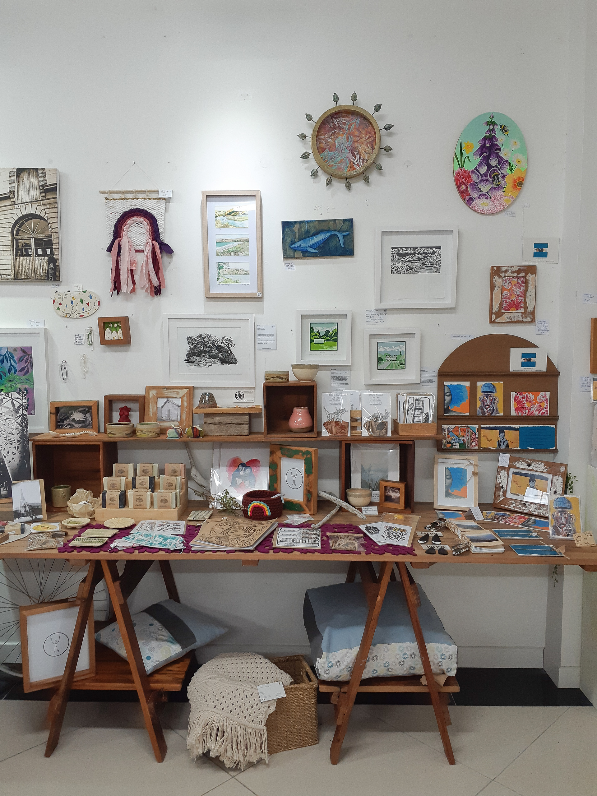
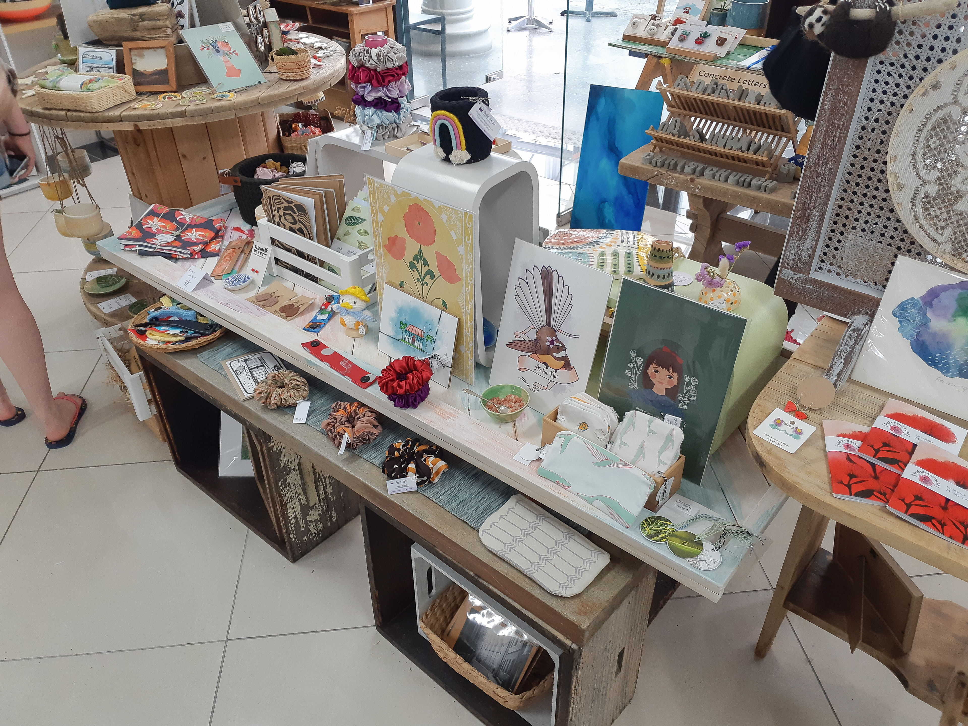
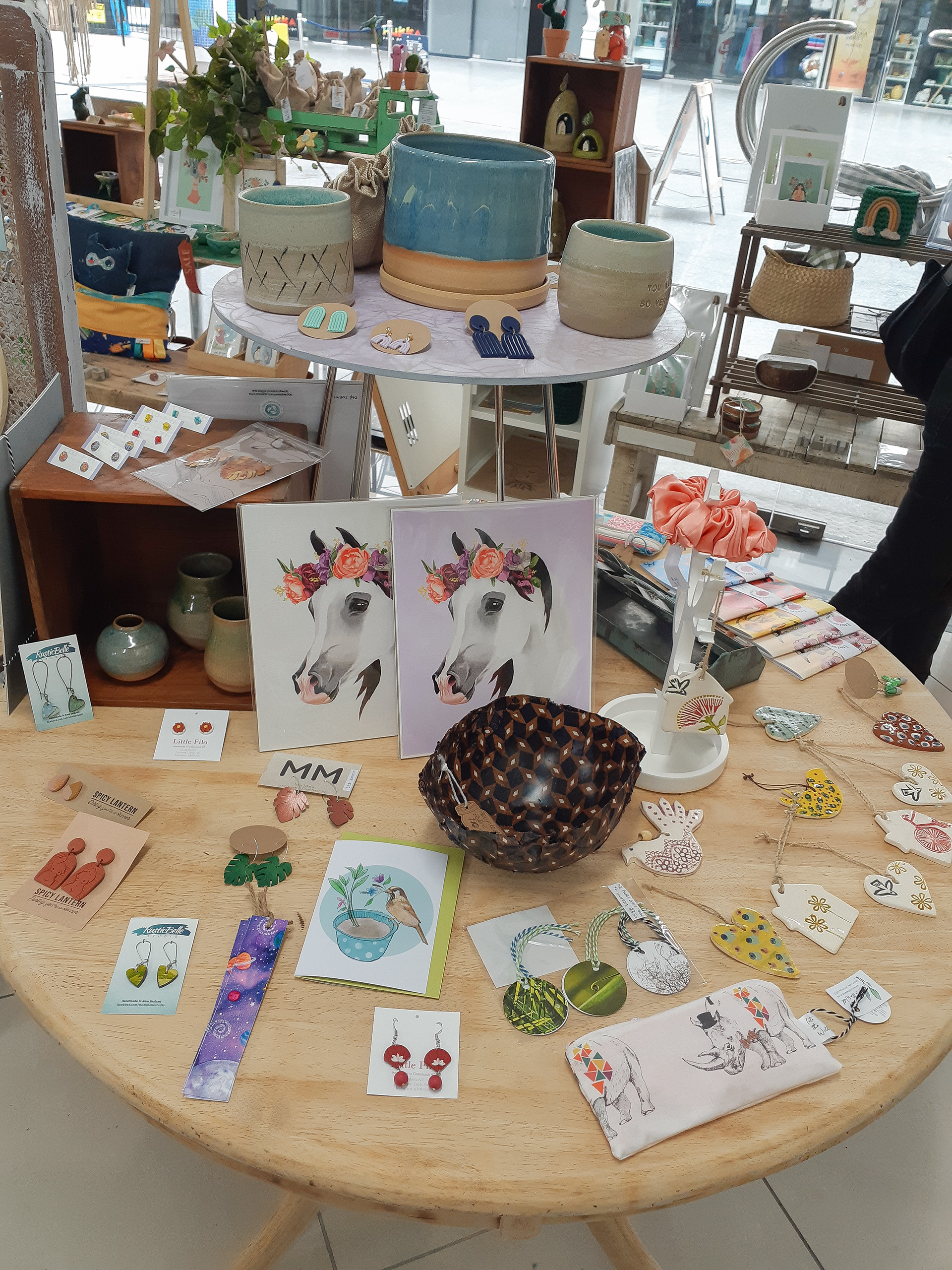
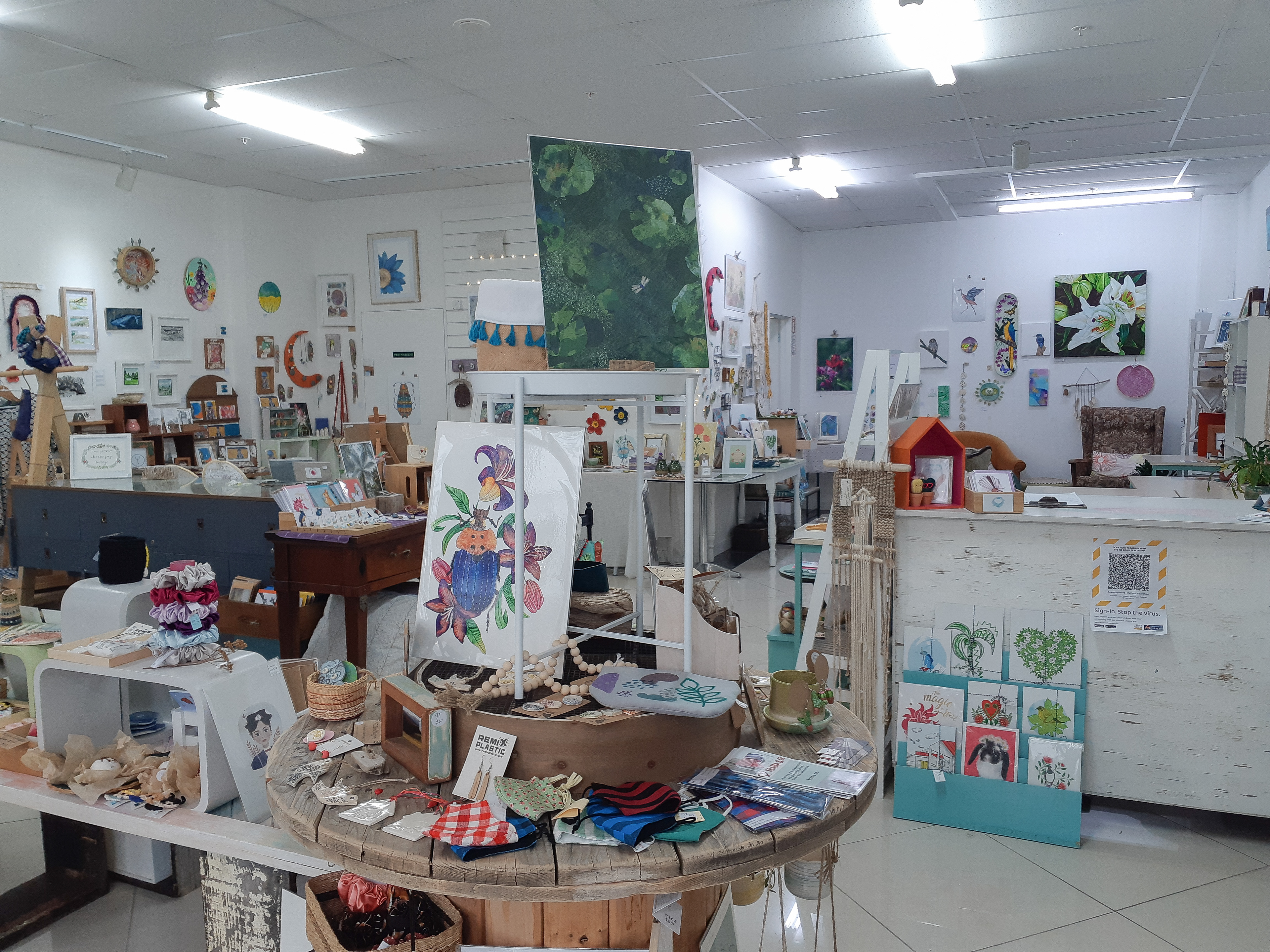
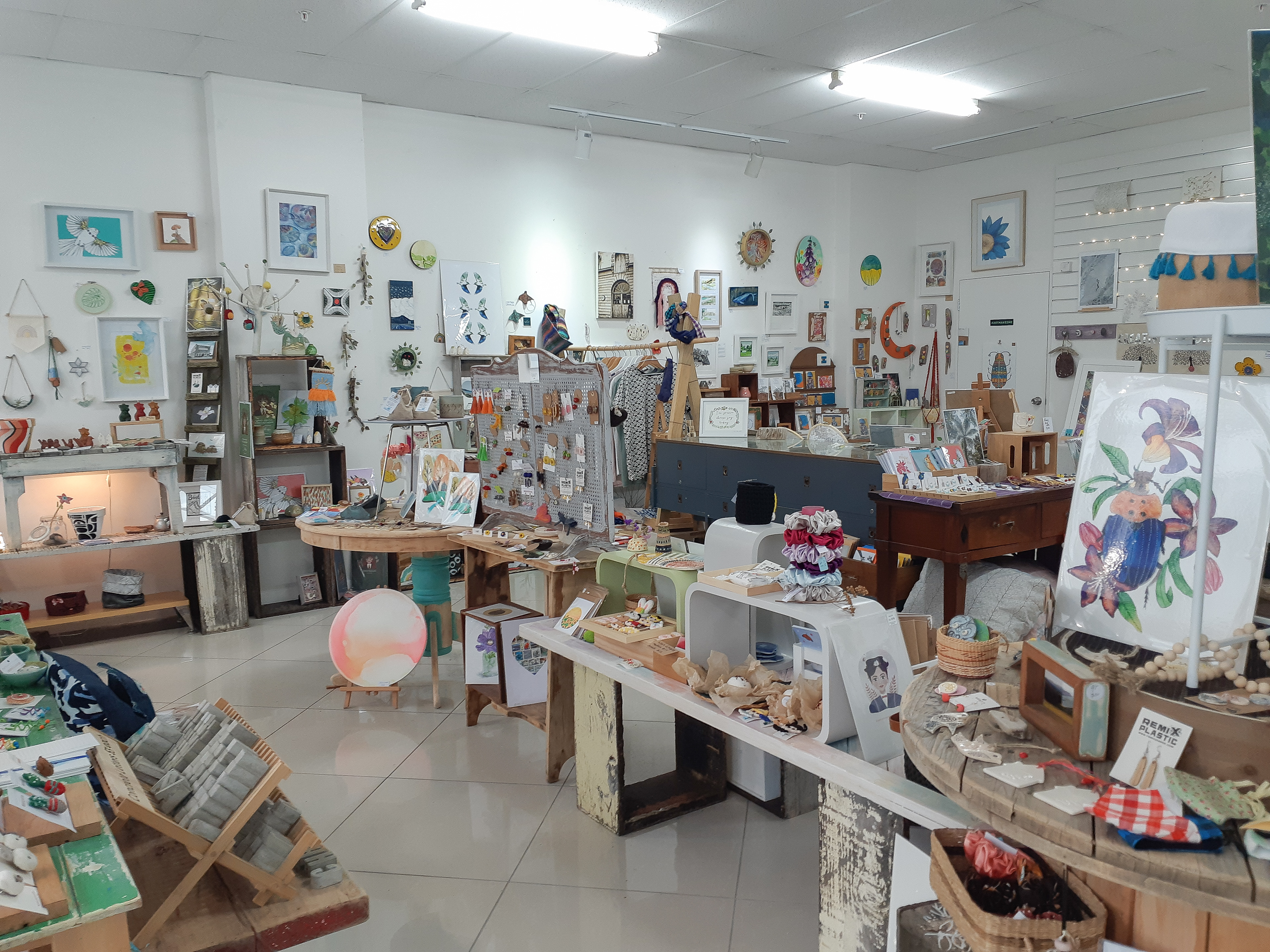
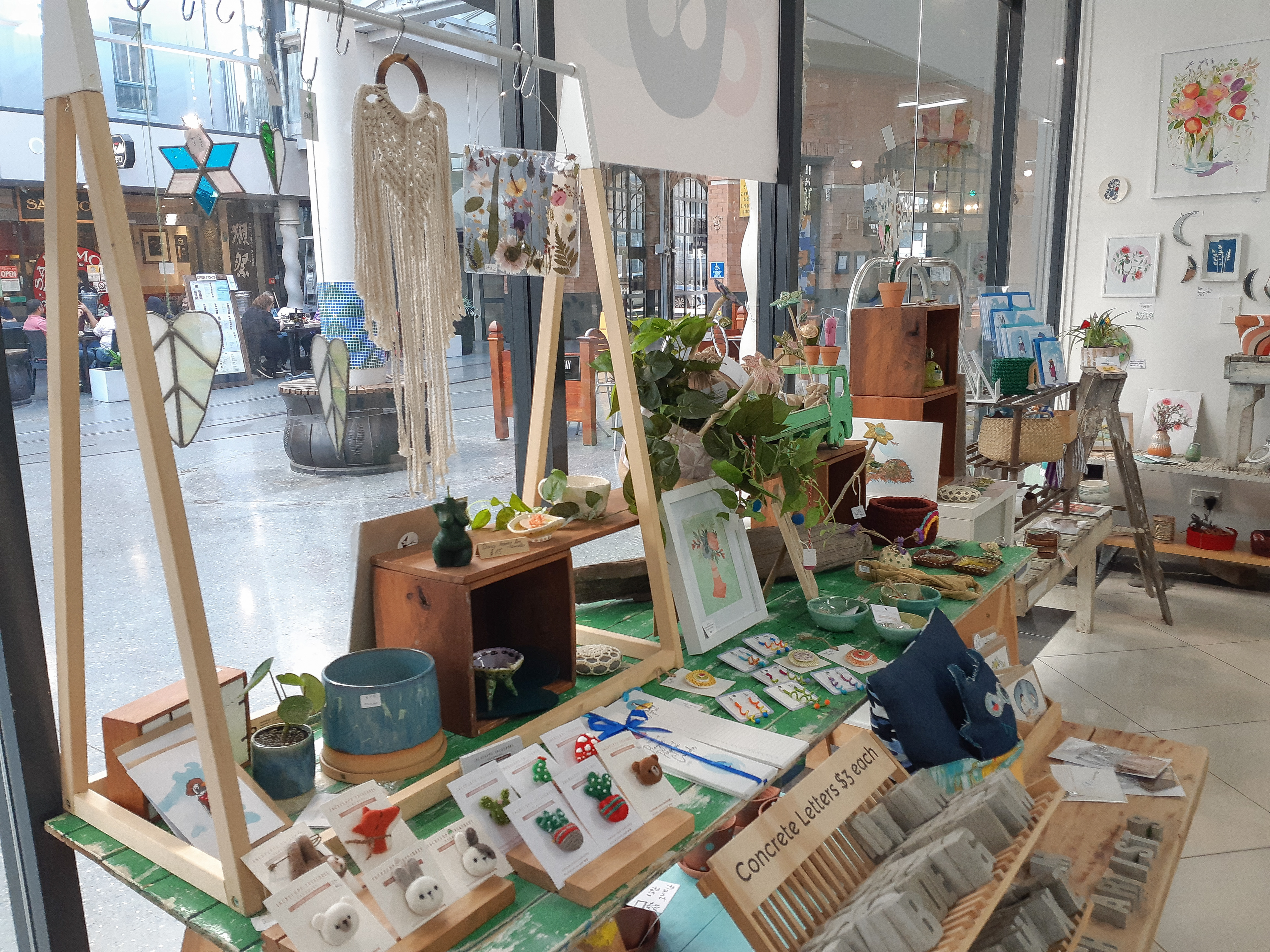
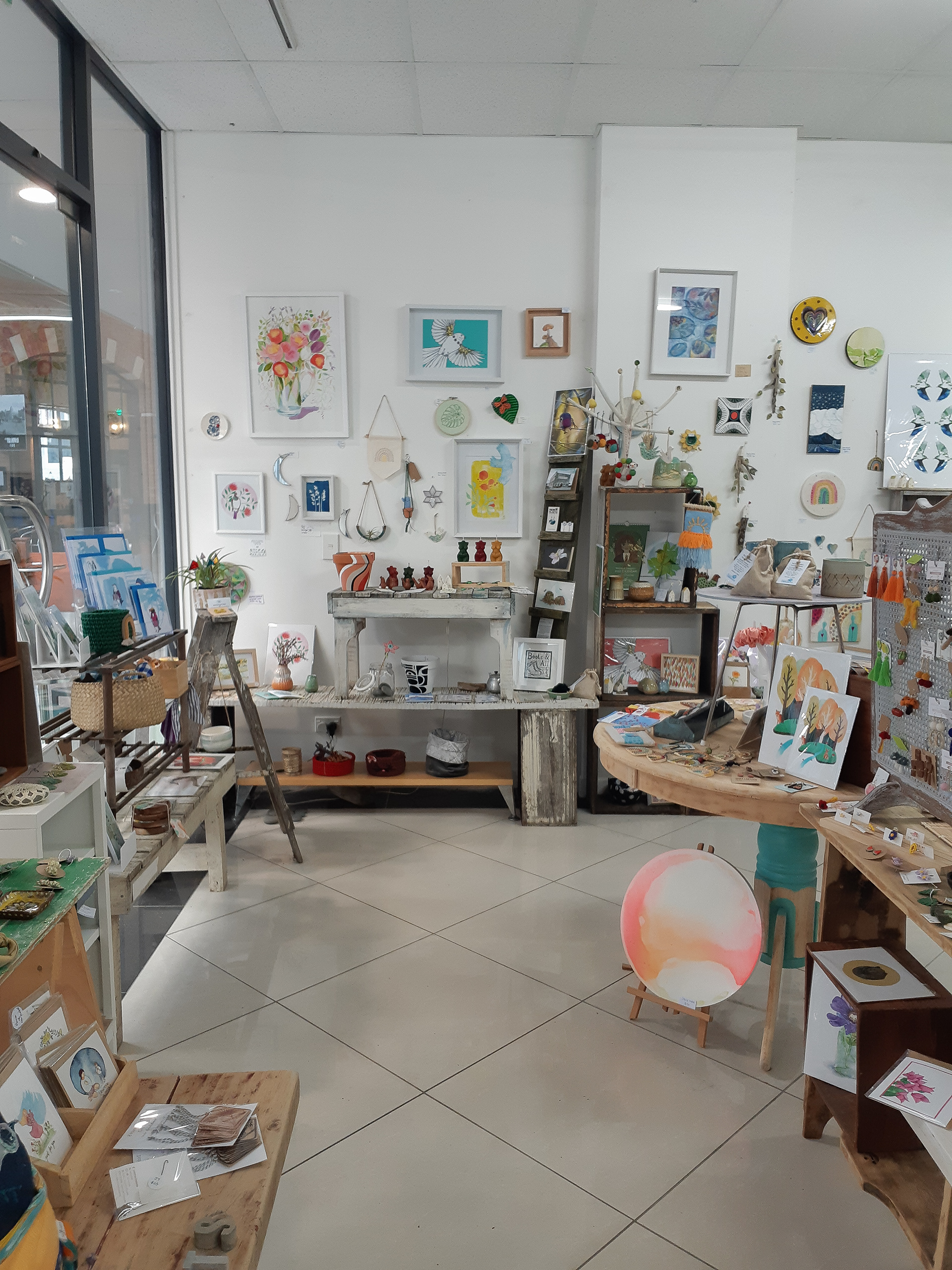
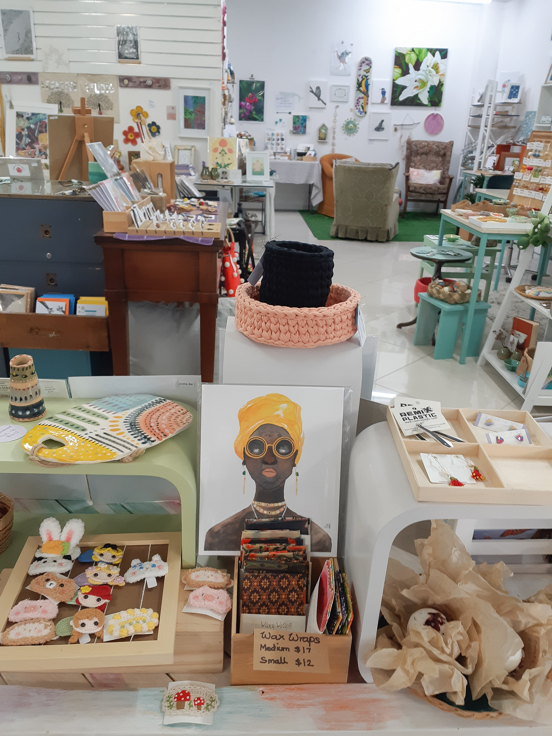
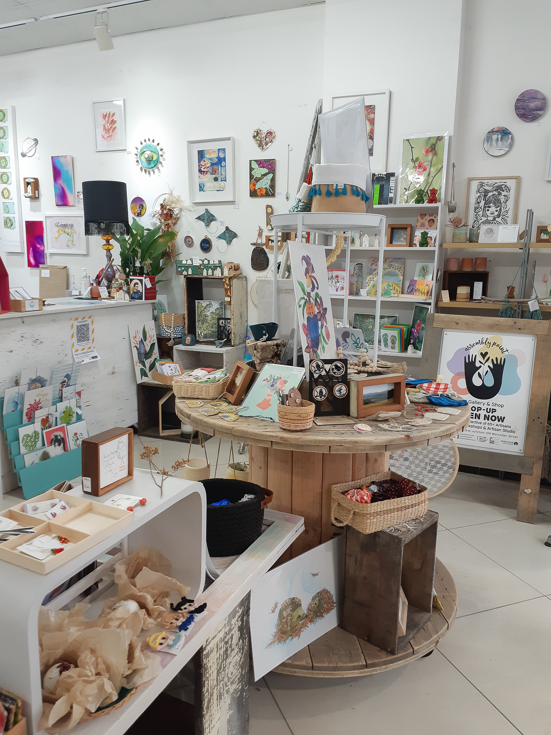
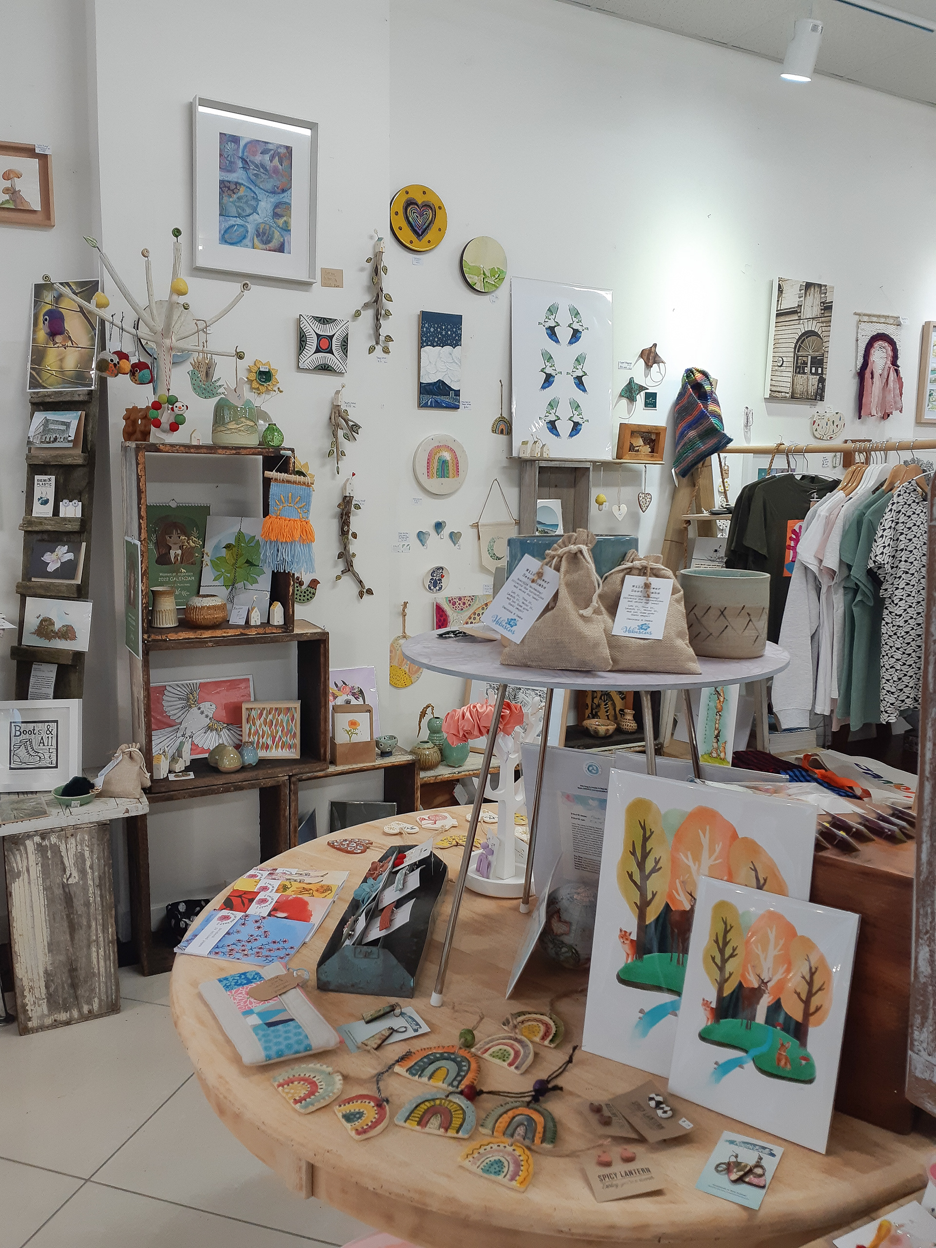
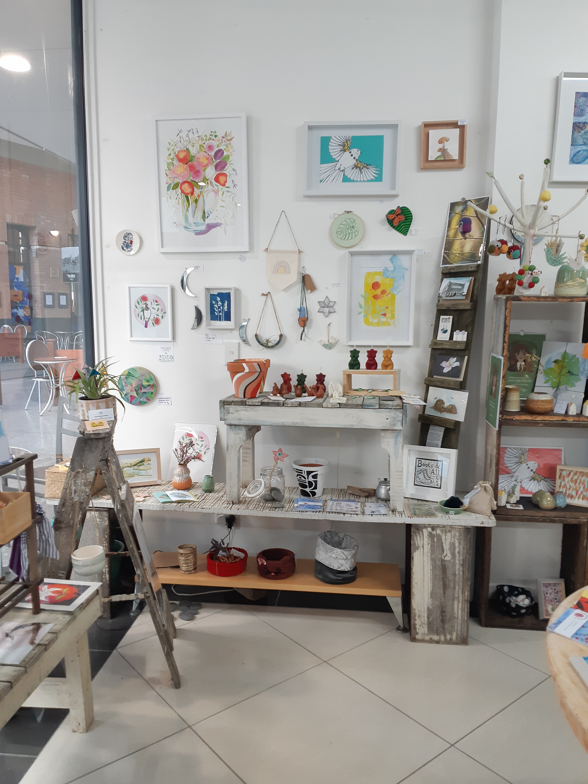
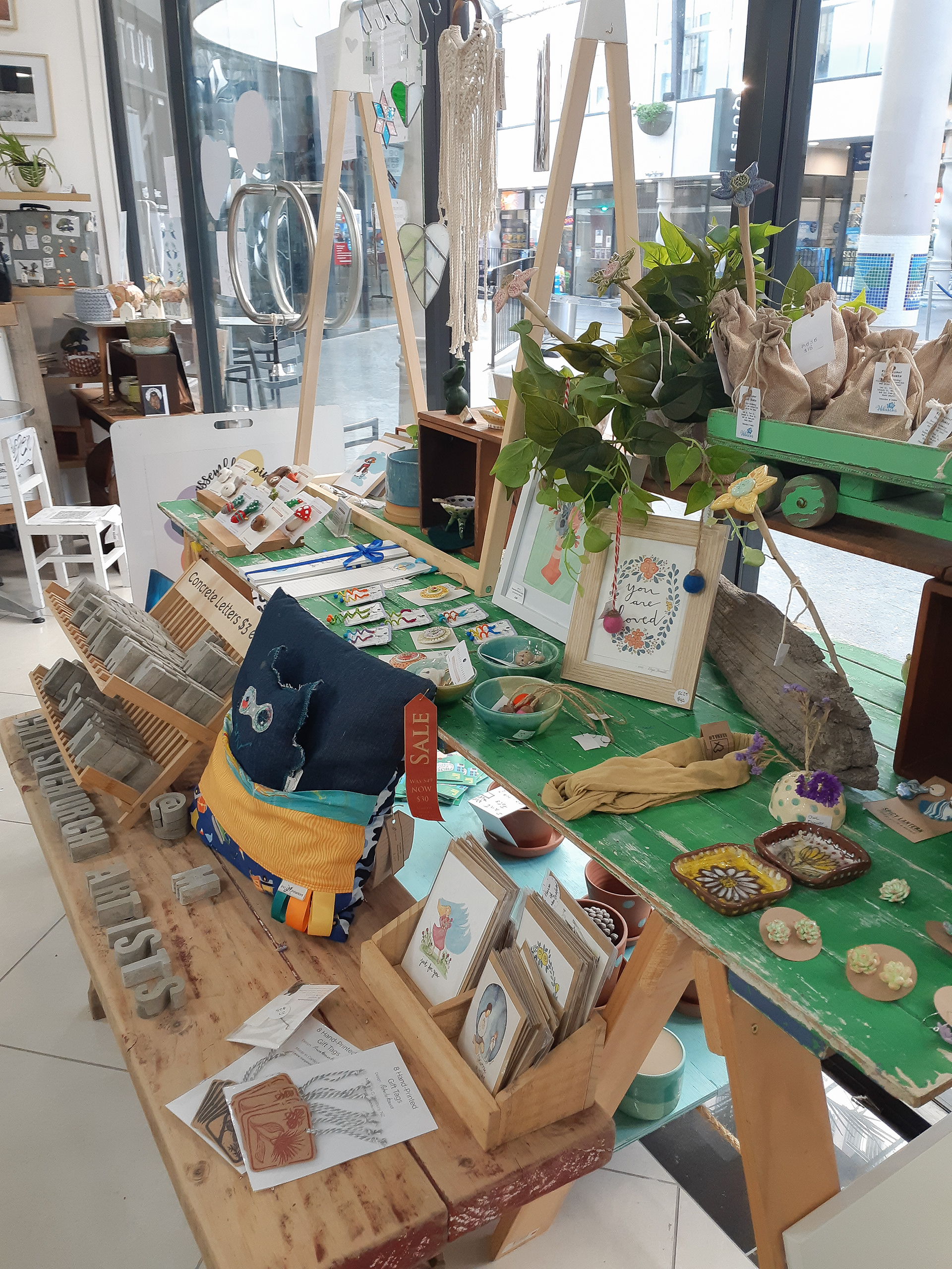
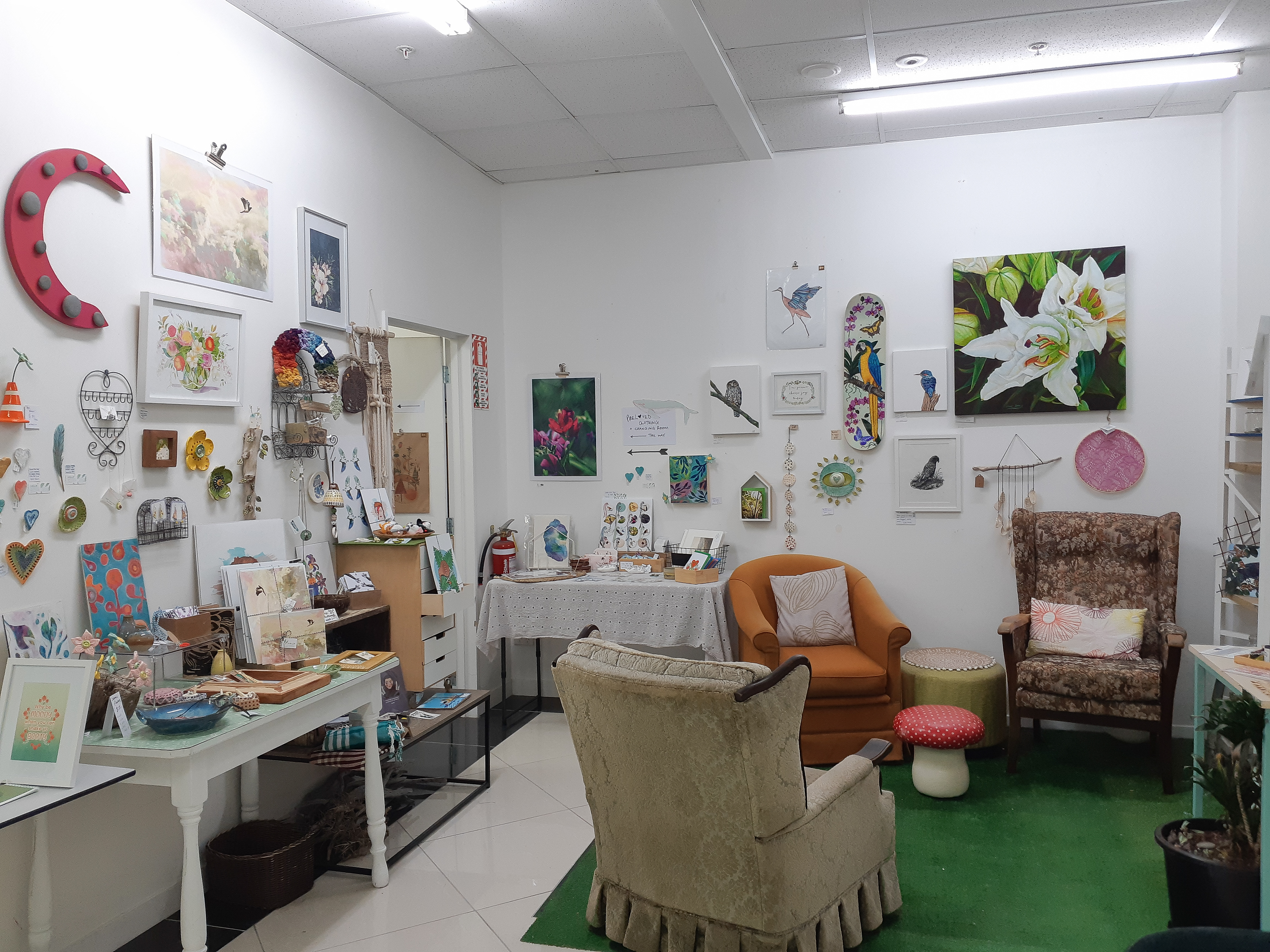
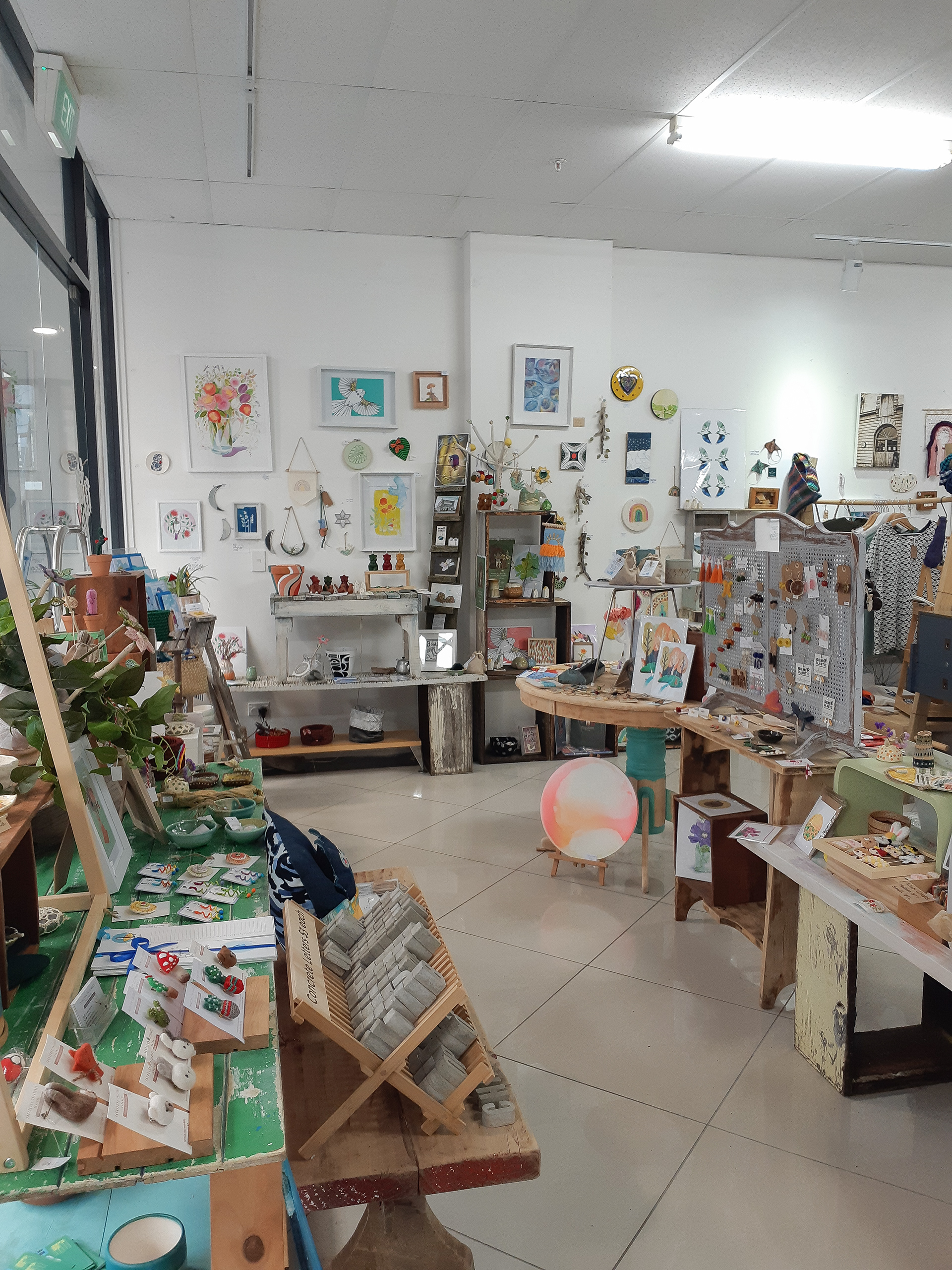
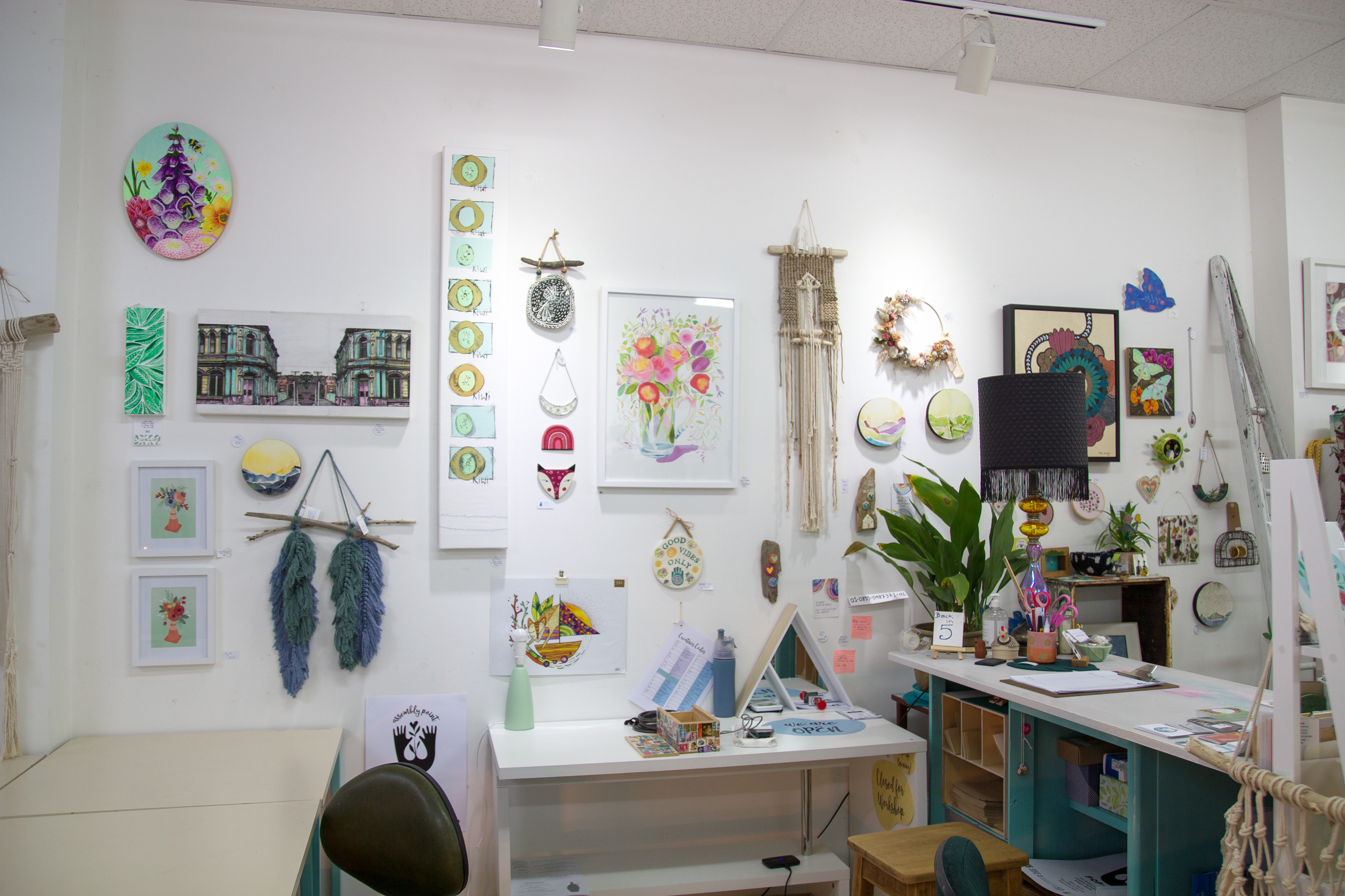
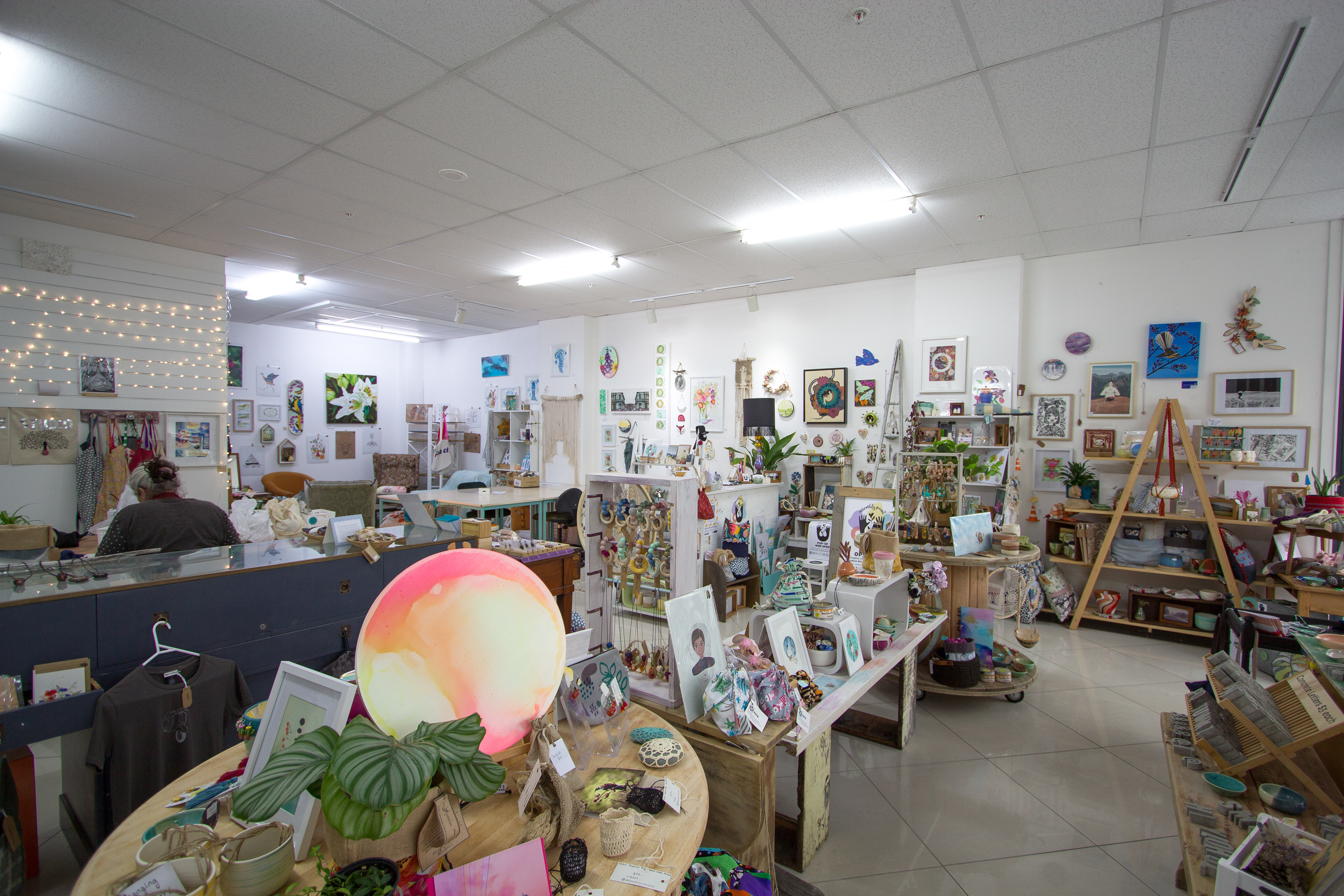
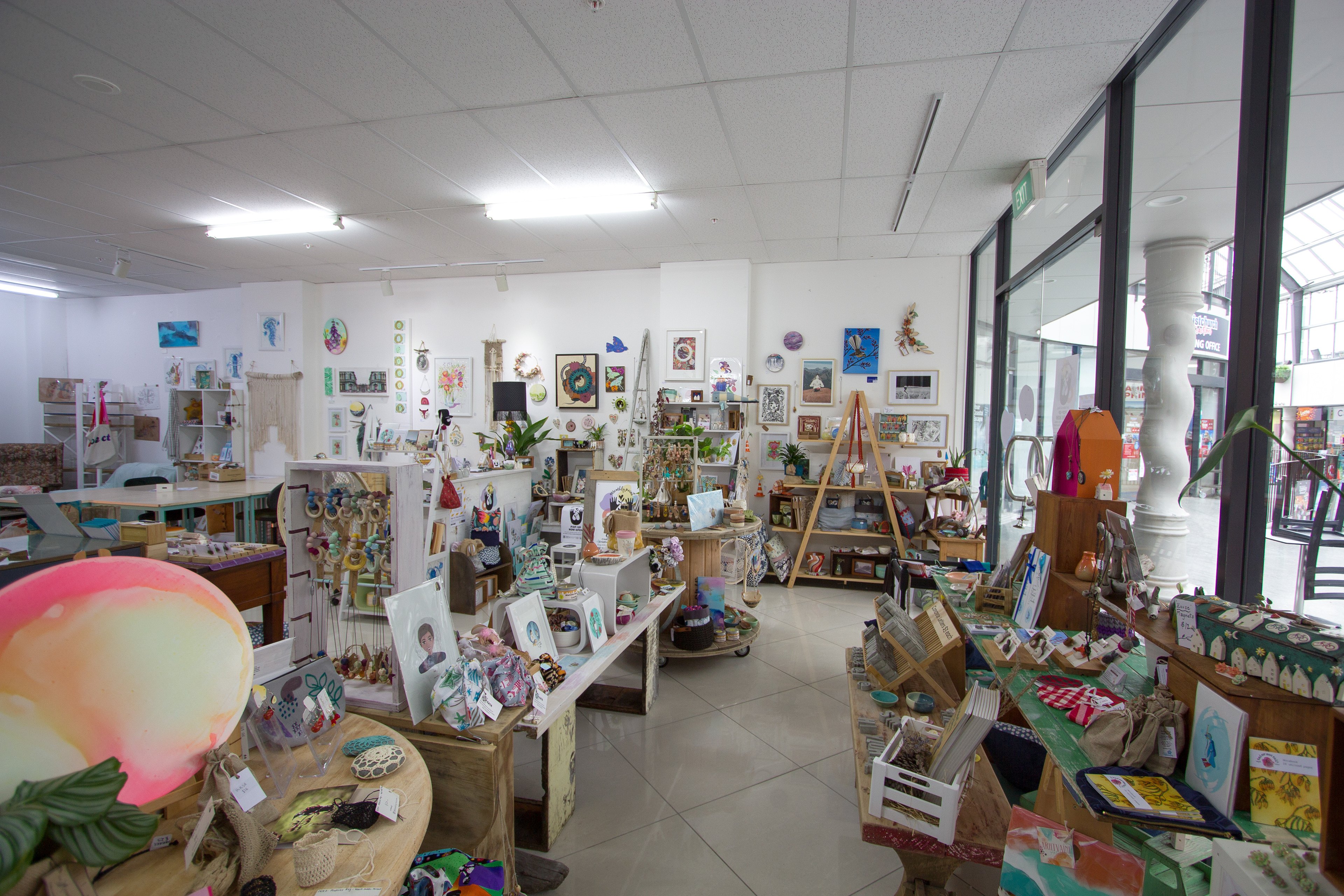
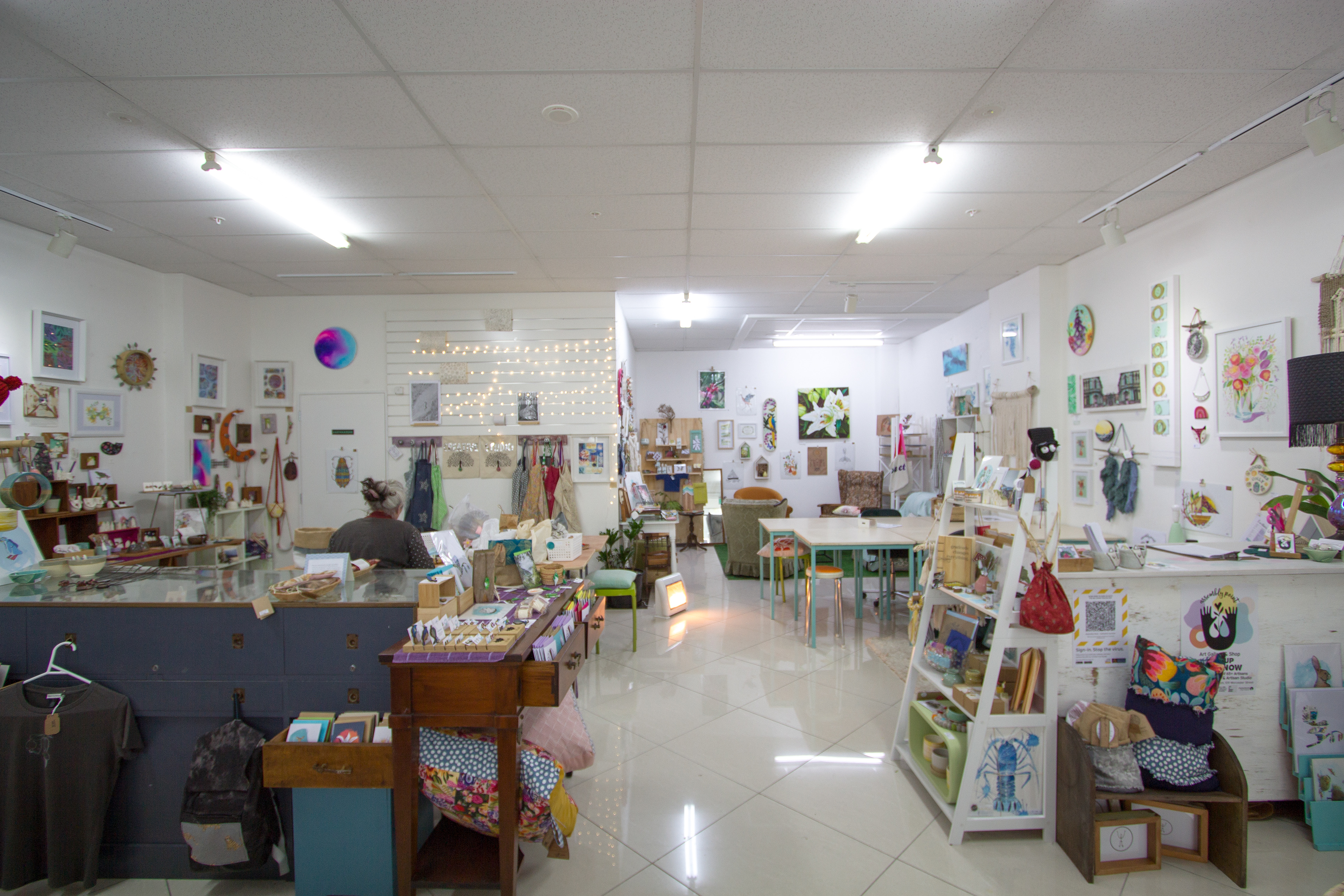
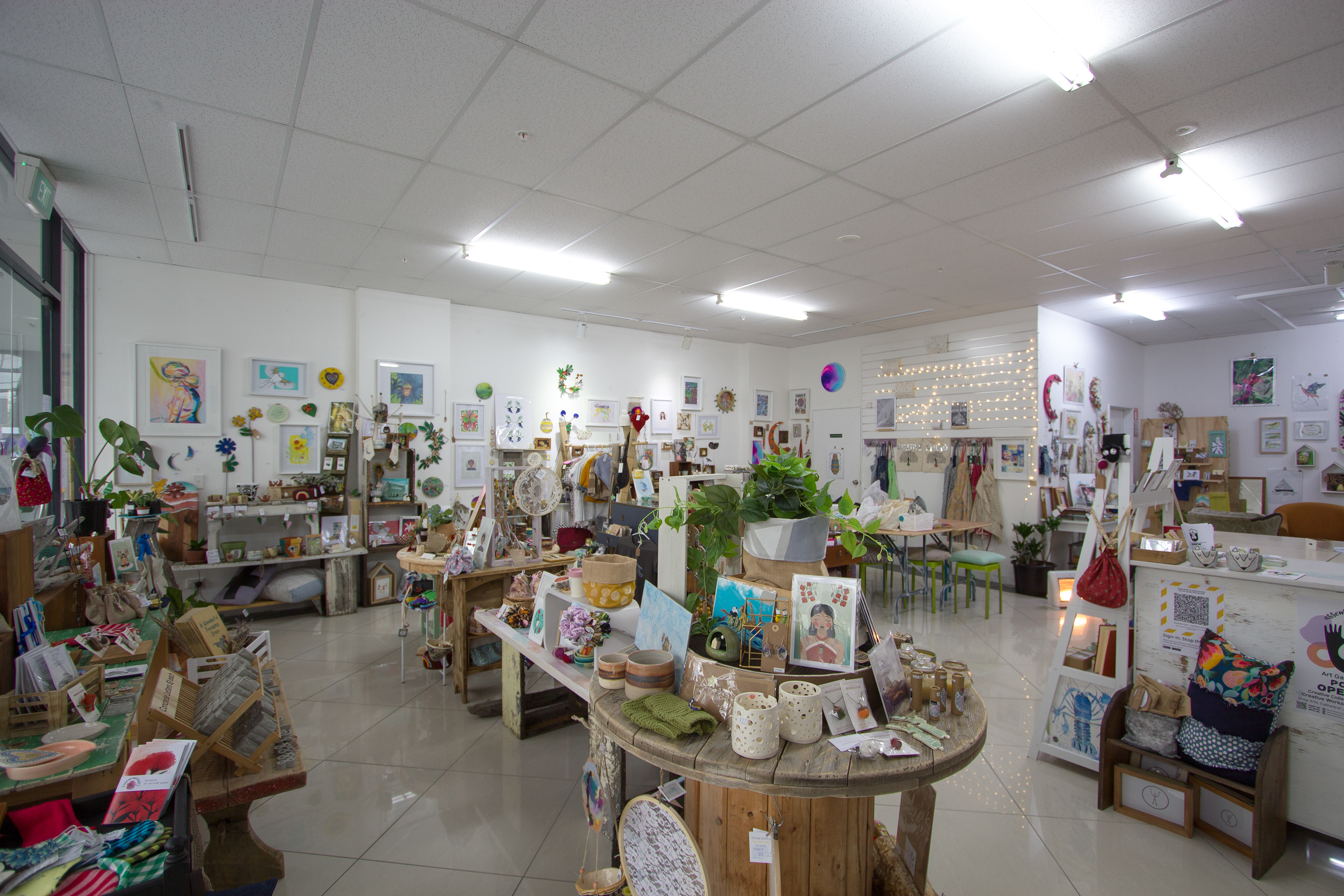
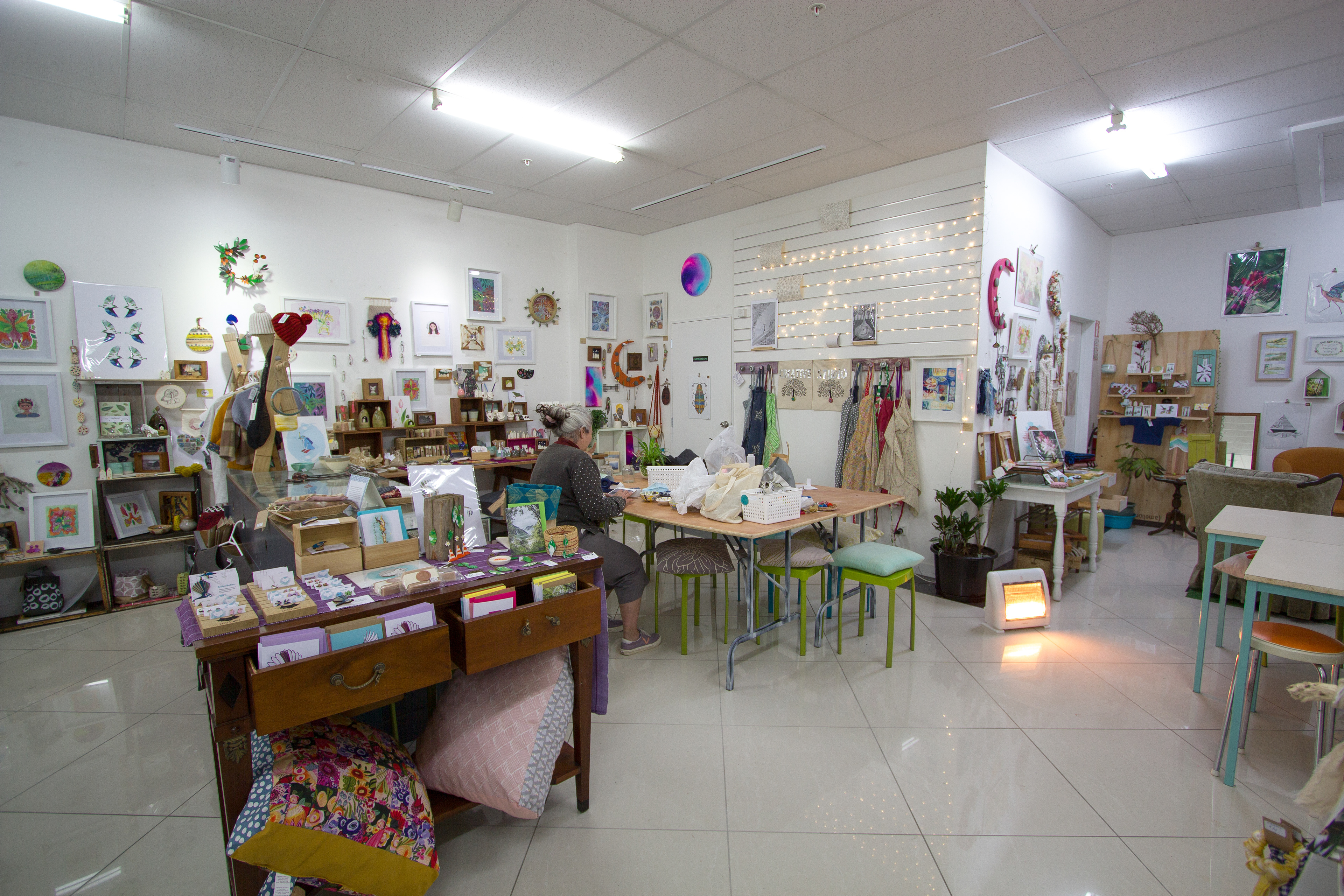
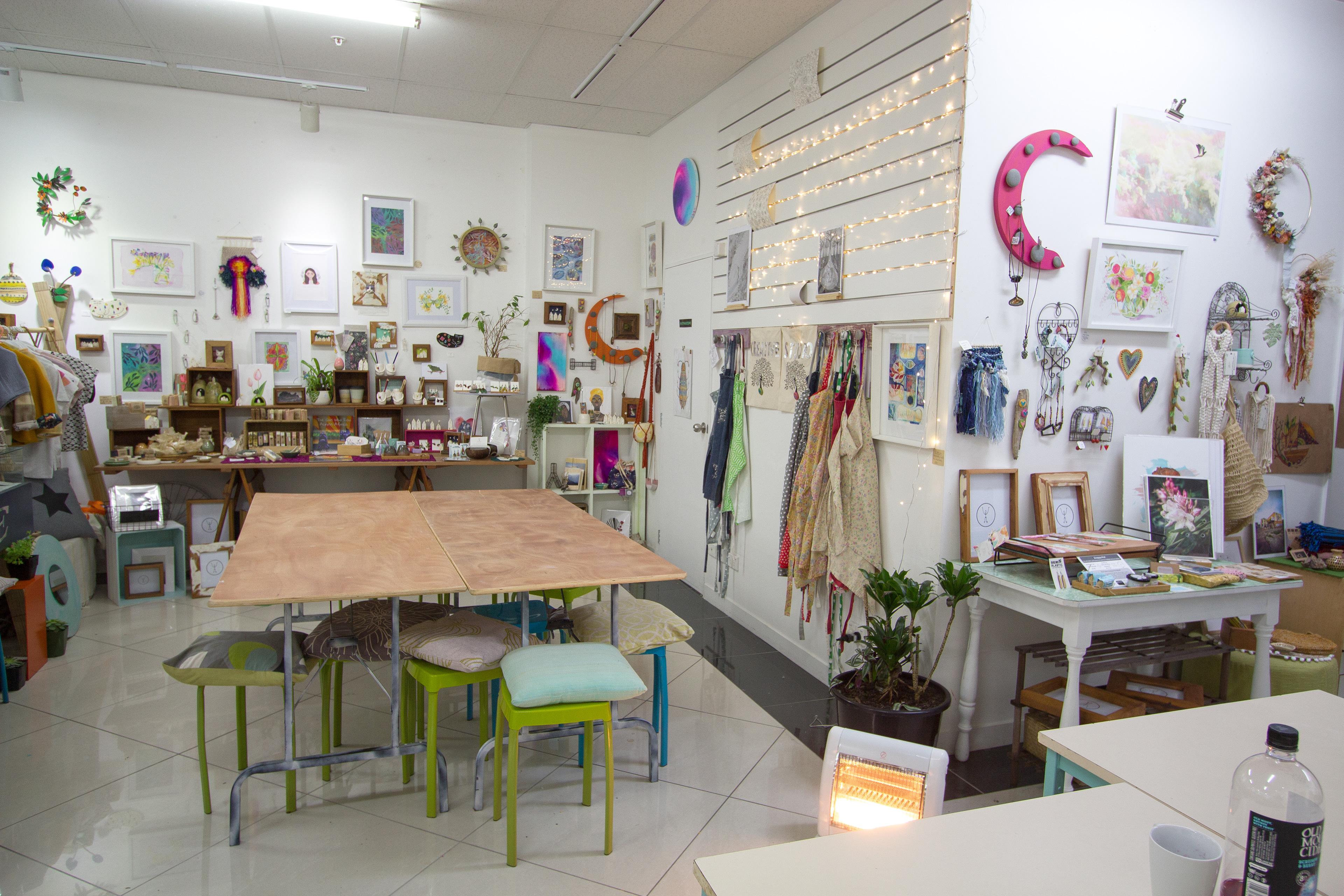
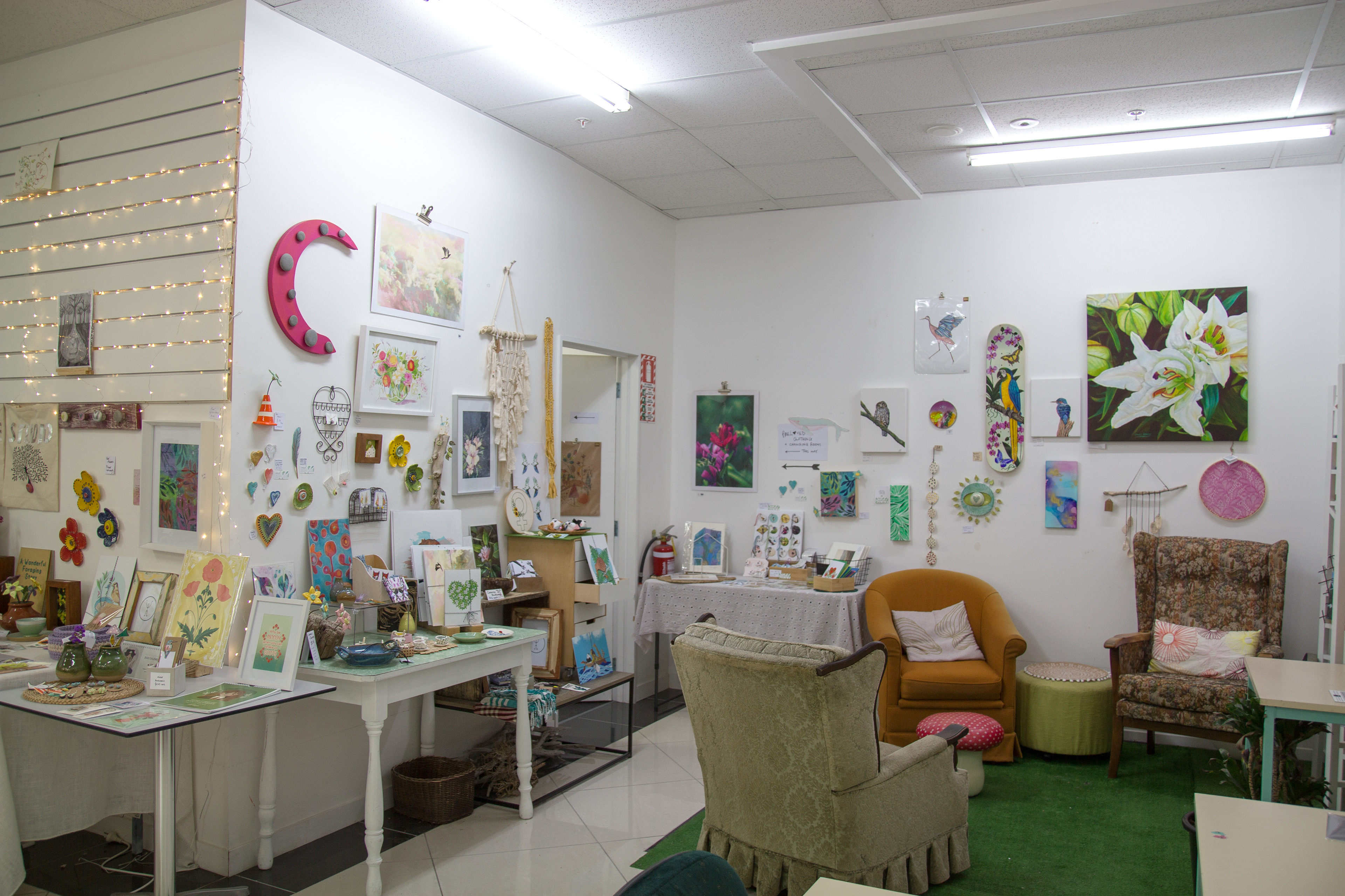
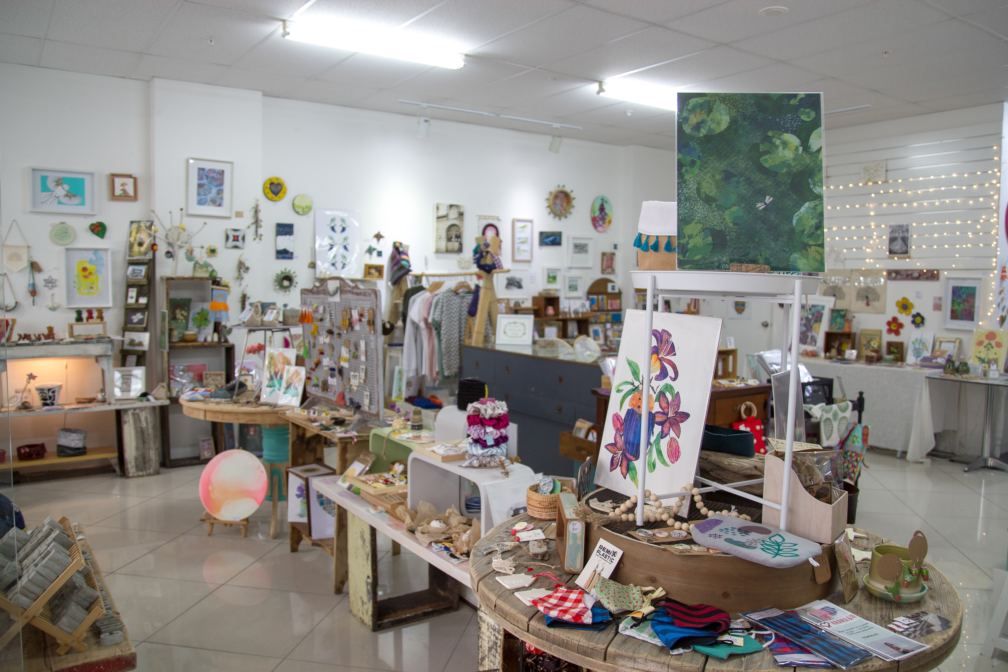
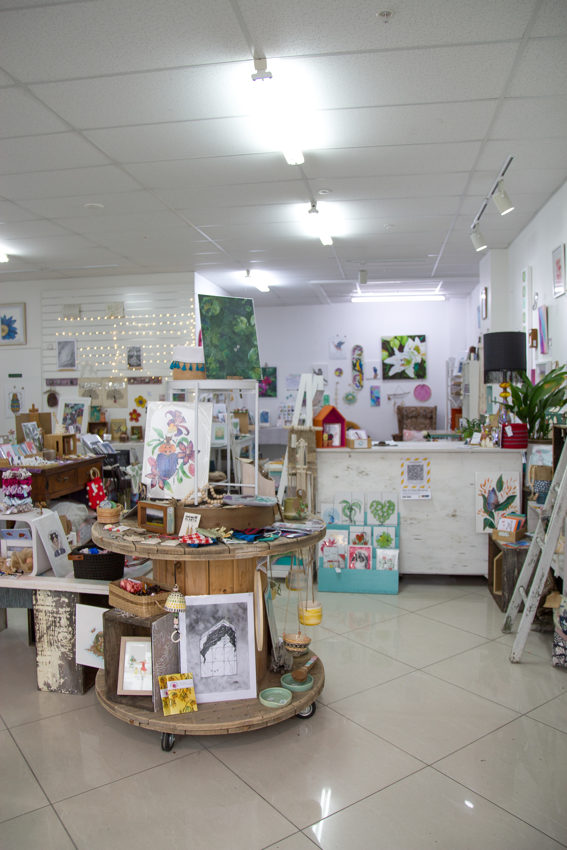
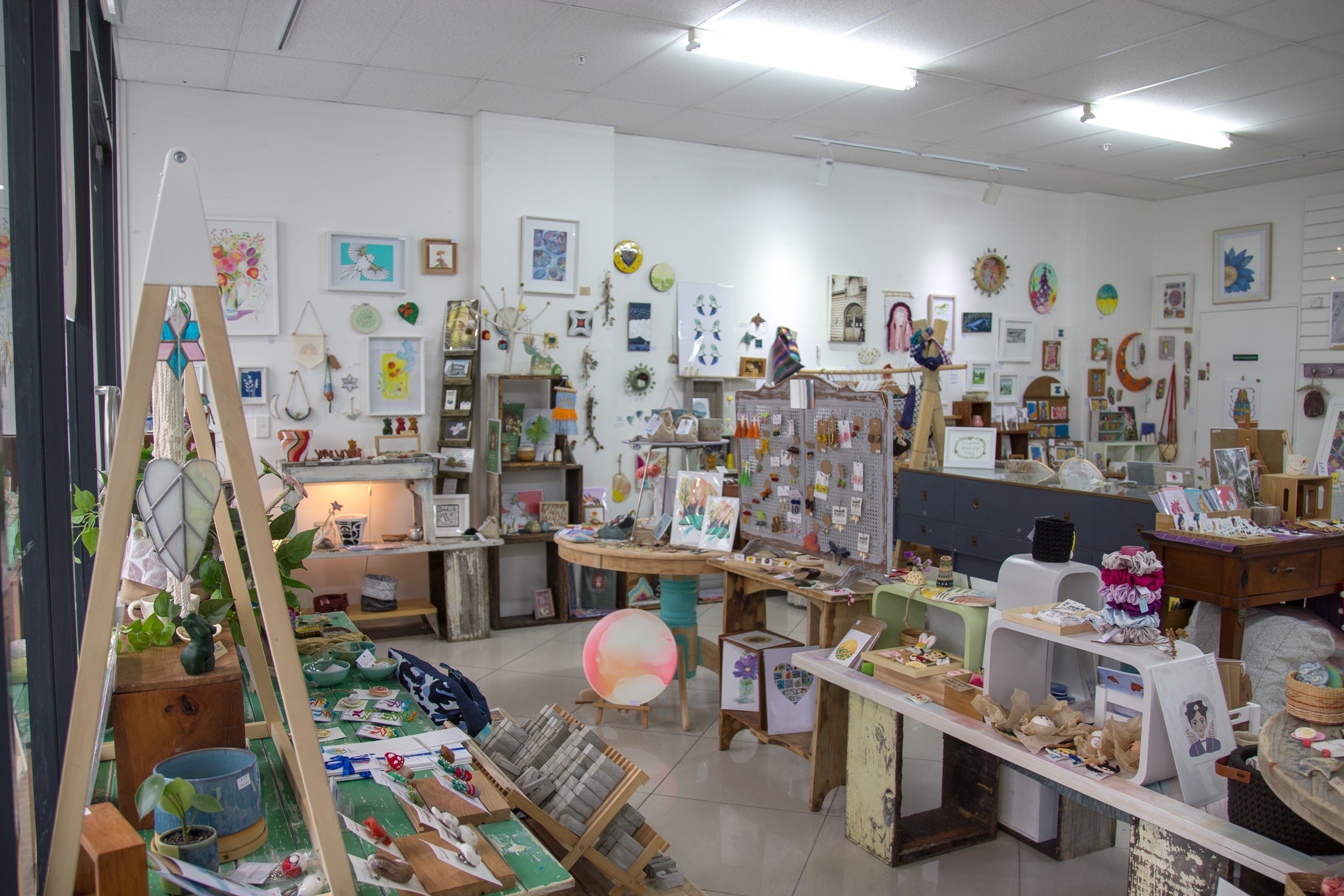
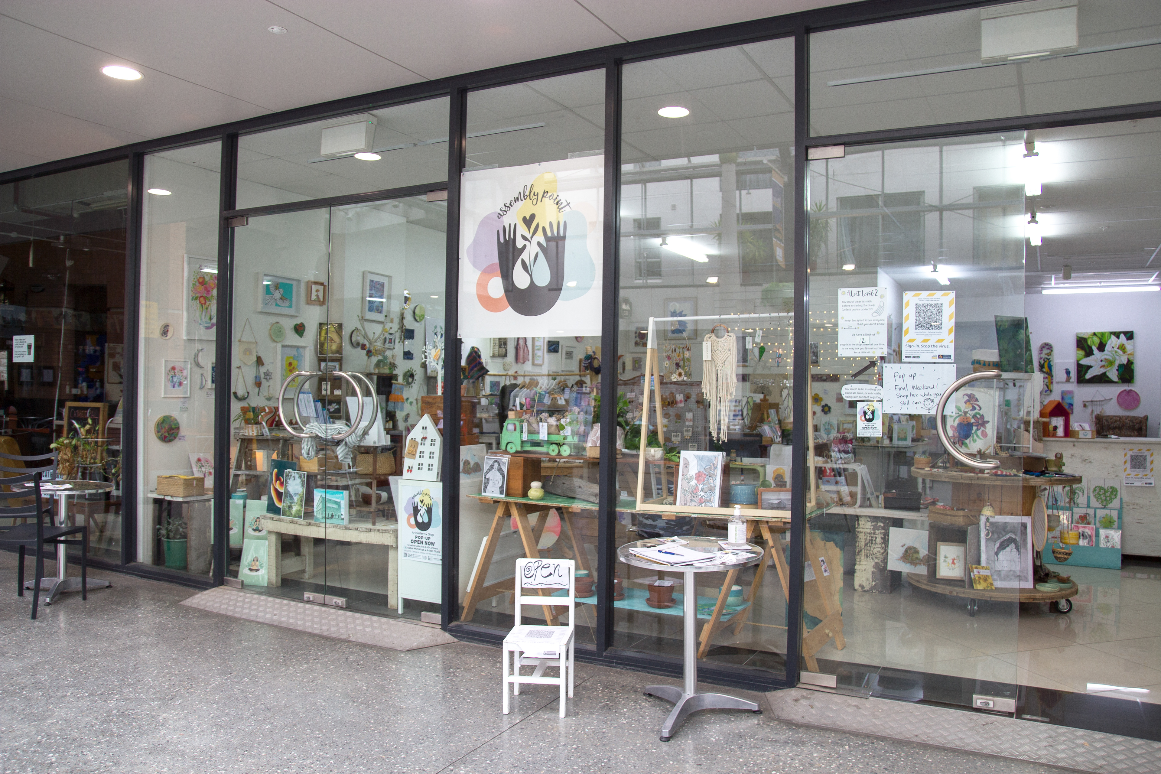
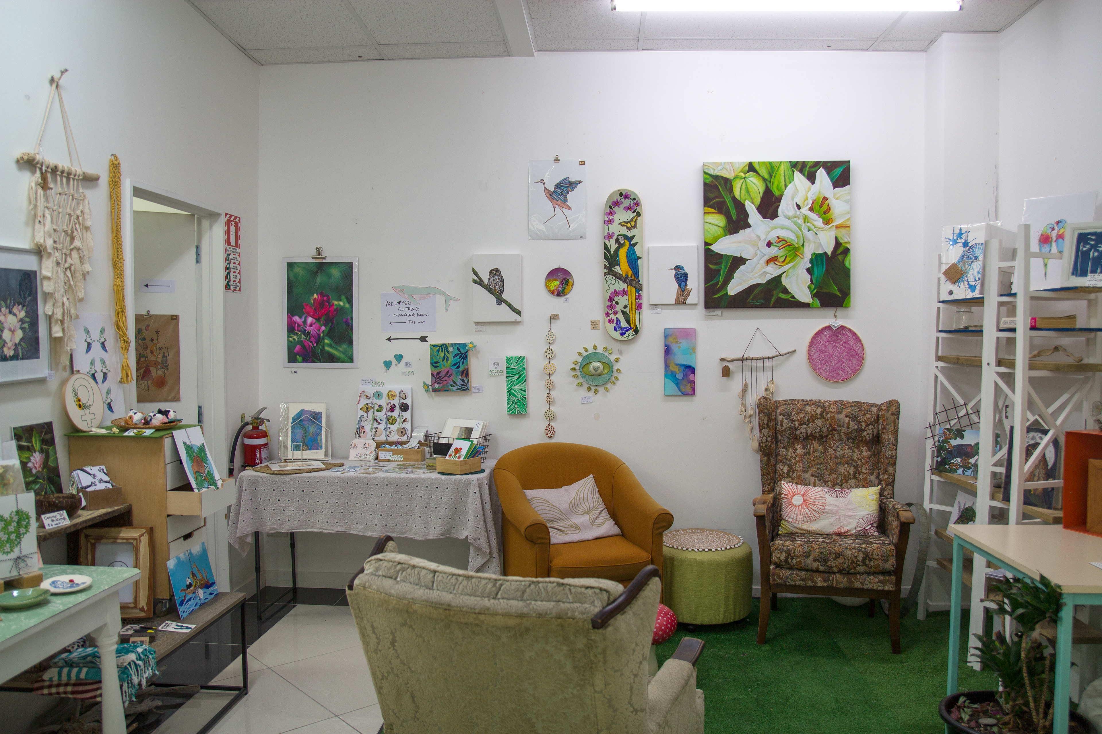
Below are some images of the actual shop space. This was a bit of a moveable feast, and changed around a bit throughout our 6 month pop-up. We had 80 artists join us with their work throughout the 6 months, and we moved pieces around and filled spaces as work sold. We had a shop space, a workshop space, an artist workspace as well as a chill loungey hangout space. We had every wall filled with art, and shop spaces that meandered through the whole space. The customers loved this as well as the volume of beautiful high quality work that was throughout the space. We had the added challenges of Covid, with social distancing within the space, which meant we spread out through the workshop space and the artist workspace when we were holding events. Assembly Point was meant to be a warm and welcoming creative space throughout the winter months, and it was certainly that and more. An absolute gem of a place packed with immense goodness and beauty.